 polski
 español

 Monika Borowiec
Each of the available widgets in the CMS 4media system comes with internal customization options. In practice, you can decide on the appearance of each widget separately.
This way, the administrator can create a distinctive design for each widget running on the website.
Where can I change the appearance of widgets?
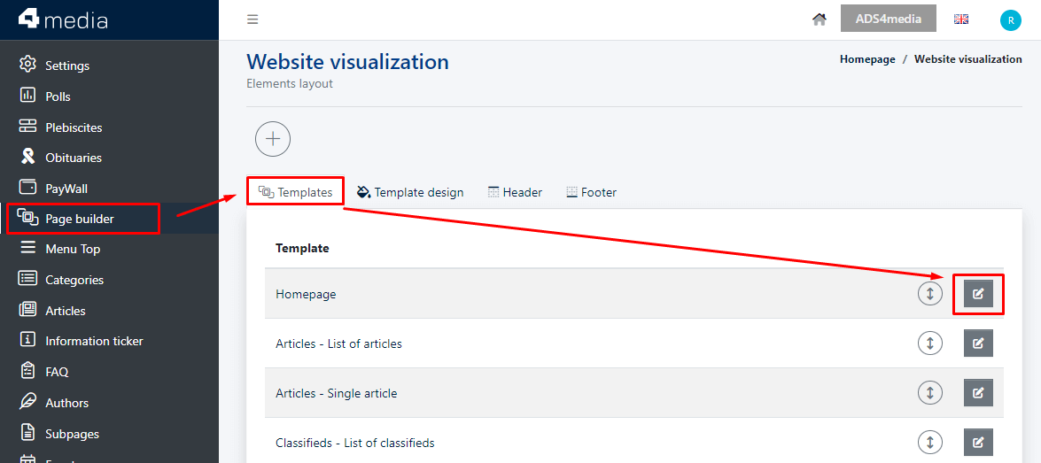
To edit the appearance of widgets, in the main menu on the left, select the "Page builder" module.
A list of page templates will appear, representing layouts of specific subpage types that you can edit. You can change the design of widgets, their order on the page, and their display on mobile devices (tablets, smartphones) as well as desktop devices (computers, laptops).
Choose the template in which you want to make changes and click on the pencil icon ("Edit" button) to access the widgets displayed within that template.
Editing widget design
On the specific page template editing view, select the widget whose appearance you want to edit.
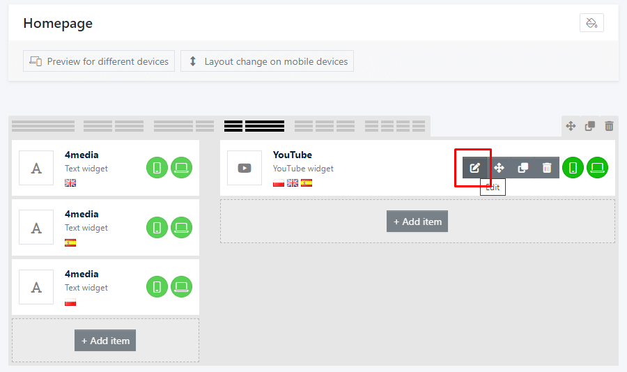
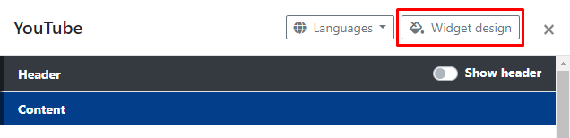
Next, click on "Widget design" in the upper right corner.
A section will expand, where you can make decisions about various visual aspects of the specific widget.
Widget design
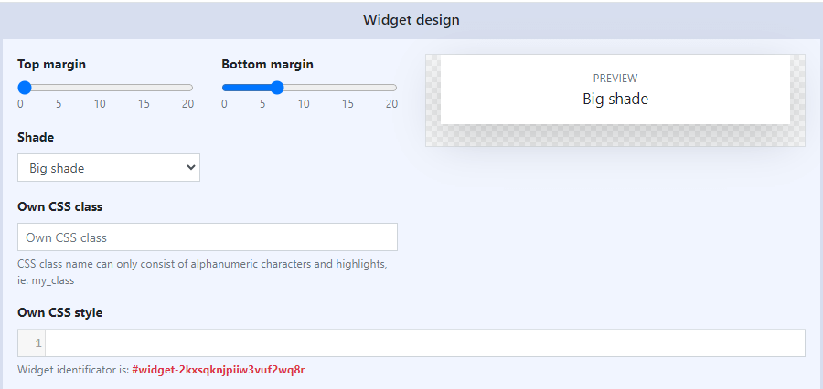
In this section, you can set:
- Top Margin: Defined on a scale of 0-20px, increases or decreases the spacing above the widget.
- Bottom Margin: Defined on a scale of 0-20px, increases or decreases the spacing below the widget.
- Shade: You can choose the type of shadow that will subtly or significantly emphasize the widget.
- Own CSS Class: Used to assign a custom CSS class name.
- Own CSS Style: Here you can paste your own CSS style for the widget.
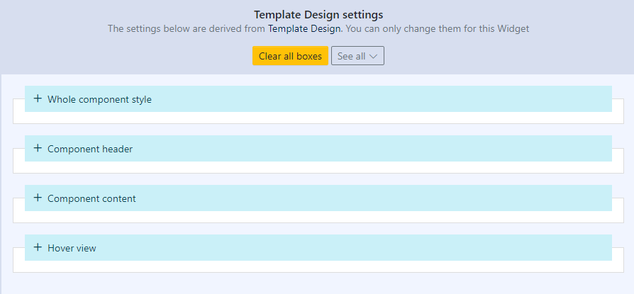
Template design settings
In this section, default template appearance settings are applied, but you can modify them. The section includes:
- Whole component style
- Component header
- Component content
- Hover view
Each of the aforementioned sections has additional settings:
1. Whole compopnent Style - In this section, you shape the entire widget:
- Font style, size, thickness, and color
- Background, border, and inner spacing for the widget.
2. Component Header - In this section, you shape the header:
- Header style: font style, size, thickness, and color; background, border, and inner spacing between displayed header elements.
- Header icon: size, color, background, border style, and color for the chosen icon.
- Header text: font style, size, thickness, and color; background, border, and inner spacing between displayed text and other elements in the header.
- Header menu: font style, size, thickness, and color; background, border, and inner spacing between displayed menu (horizontal or dropdown) and other elements in the header.
3. Component Content - In this section, you further modify elements displayed below the widget header:
- Content style: font style, size, thickness, and color; background, border, and inner spacing between displayed content and other available elements.
- Title style: font style, size, thickness, and color for displayed titles.
- Additional settings: Layer above image - specify font and background color for text displayed in the layer above an image.
4. Hover view :
- Determine the visual effects to be applied to the header (icon, text, and menu) as well as content elements (title and layer above image) when hovered over with the mouse cursor. Available visual effects include changing font/background color and text underline for the respective elements.
Additionally, for each widget, displaying the header as a whole and its individual elements (icons, links, menu) is optional.
Related guides:


")
