 polski
 español

If you need to add fields for subscribers' home addresses, for instance, to send them a printed version of your newspaper, this is now possible. Of course, this module allows for a much broader range of fields to be added depending on your needs – these fields will be described in more detail later in this text.
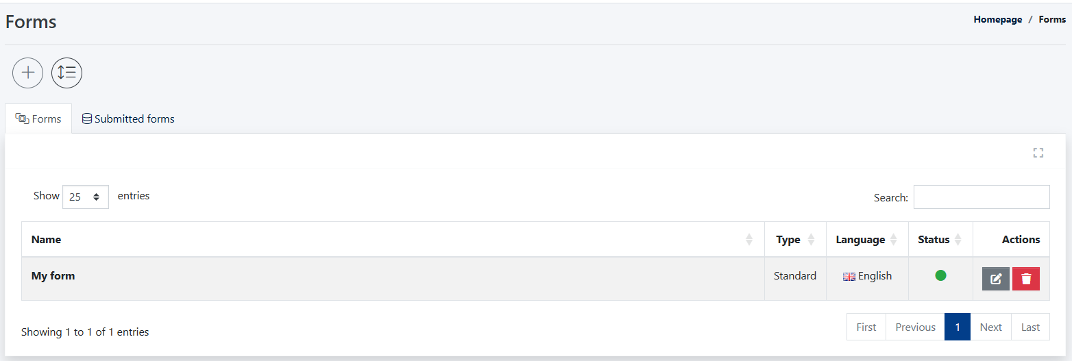
After logging into the Admin Panel in CMS 4media, navigate to the [Forms] tab located in the dark gray module menu on the left side of the screen. You will then be taken to the list of already created contact forms, which will initially be empty.
Creating a New Form
To create a new form, click on the + icon under the Forms header. You will then see the following settings:
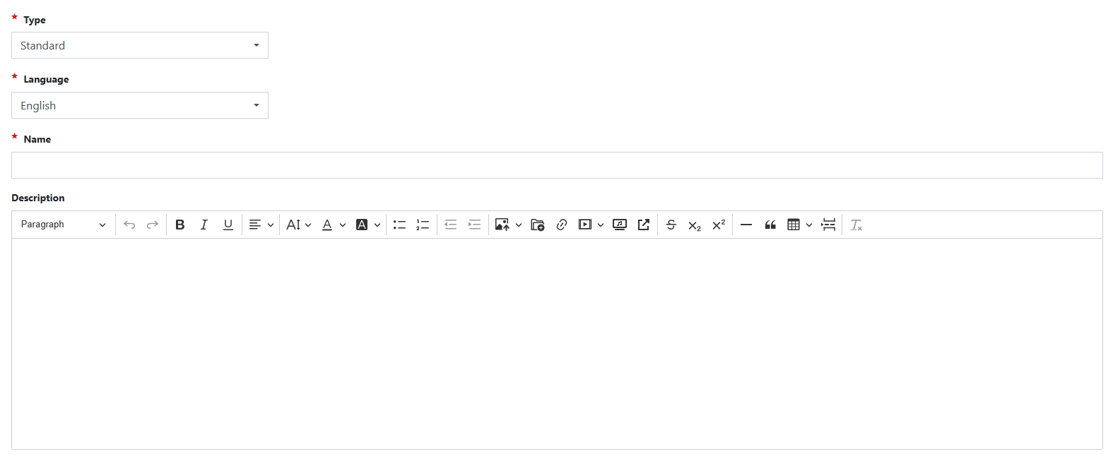
- Form Type – Here, you specify whether you want to create a separate form or add additional fields to an existing one. Select the form type from the dropdown list:
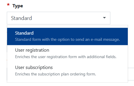
- Standard – This option allows you to create a separate form that will be available on the portal at URL /forms.
- User Registration – Adds new fields to the form used for registering new users on the portal. By default, this form includes fields for Email Address, Password, First Name, Last Name, Gender, and Age. After selecting this form type, you can expand it with additional fields that will appear directly below the default ones.
- User Subscriptions – Similar to the previous form type, this option allows you to add extra fields to the subscription purchase form.
- Language – Here, you choose the language version of the portal in which the form should be displayed.
- Name – In other words, the title of your form, where you can specify its purpose.
- Description – Here, you can further describe the purpose of the form.
Settings
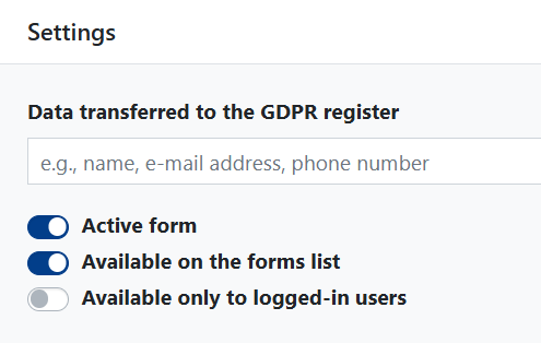
- Data Transferred to the GDPR Registry – If the form requests any personal data, you should specify it in this field.
- Active Form – Toggle whether the form is available for use on the website. You can create it in the system as inactive if you plan to refine it further.
- Available on the Forms List – Here, you decide whether you want your form to be displayed on the forms list at URL/forms.
E-mail settings
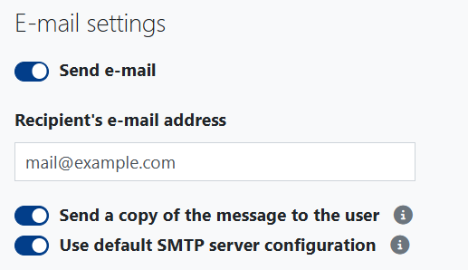
- Send Email After Form Submission – You can specify the email address to which the system should send the form filled out by the user.
- Use Default SMTP Server Configuration – By selecting this option, you choose to have the system use the email address configured in [Settings] > [Email Settings] instead of manually entering it in the field above.
- Send a Copy to the User – When this option is selected, the user filling out the form will be asked to provide their email address to receive a copy of the submitted form. This can serve as a confirmation of submission, for example, when the user subscribes to receive printed editions.
Submit Button Settings
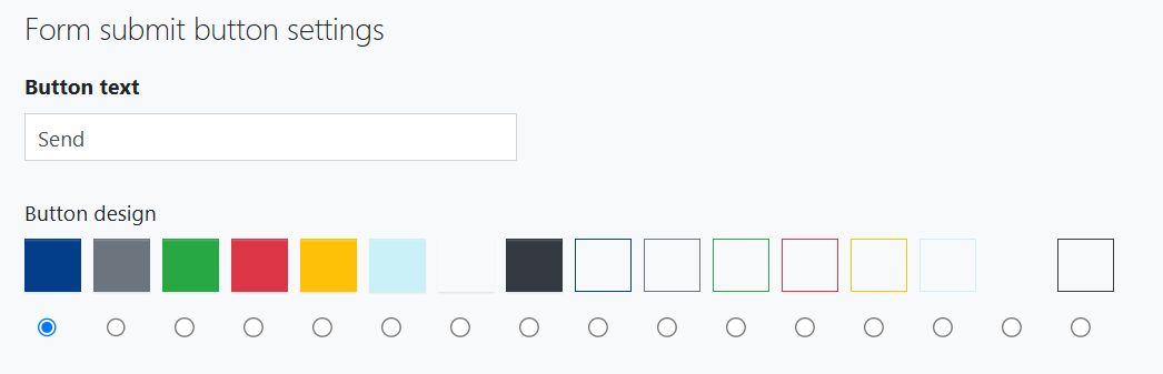
- Button Text – You can customize the text displayed on the form submission button; for example, for a subscription form, it could be "Subscribe."
- Button Appearance – You can change the button color from the available options.
Form fields
In this section, you add individual form fields. New fields are added by clicking the [+ Add New Field] button. It's also important to note that during the editing of each field, you can individually set three main parameters:
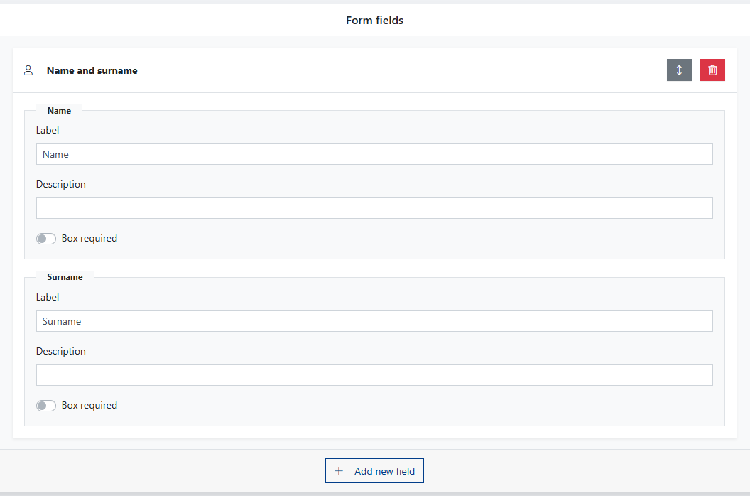
- Label – This is the name displayed above the text field.
- Description – Additional information displayed next to the field name when hovering over the info icon, explaining the purpose of the field.
- Required Field – Here, you can specify which fields must be filled out for the user to submit the form.
When adding new form fields, the following options are available:
- Name and Surname – The user provides their first and last name.
- Email Address – The user provides their email address; if they are already logged in to the portal, this field will be auto-filled.
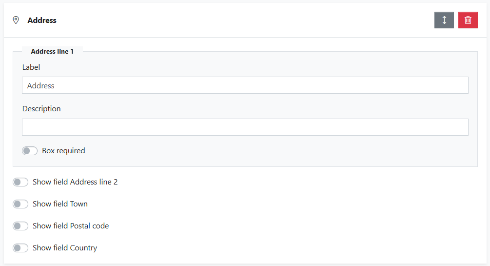
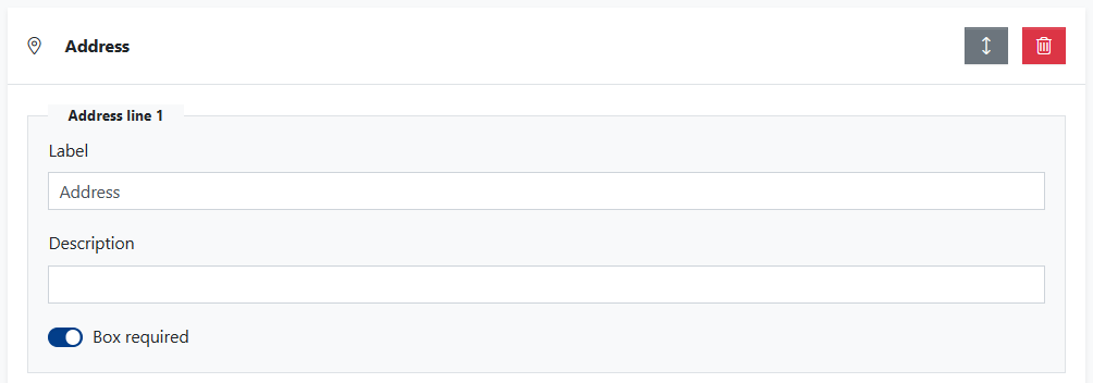
- Address – You can enable additional fields such as [Address Line 2], [City], [Postal Code], and [Country]
- Phone Number
- Website Address – A field for entering a URL.
- Short Text – A small text field available for the user.
- Long Text – A large text field available for the user.
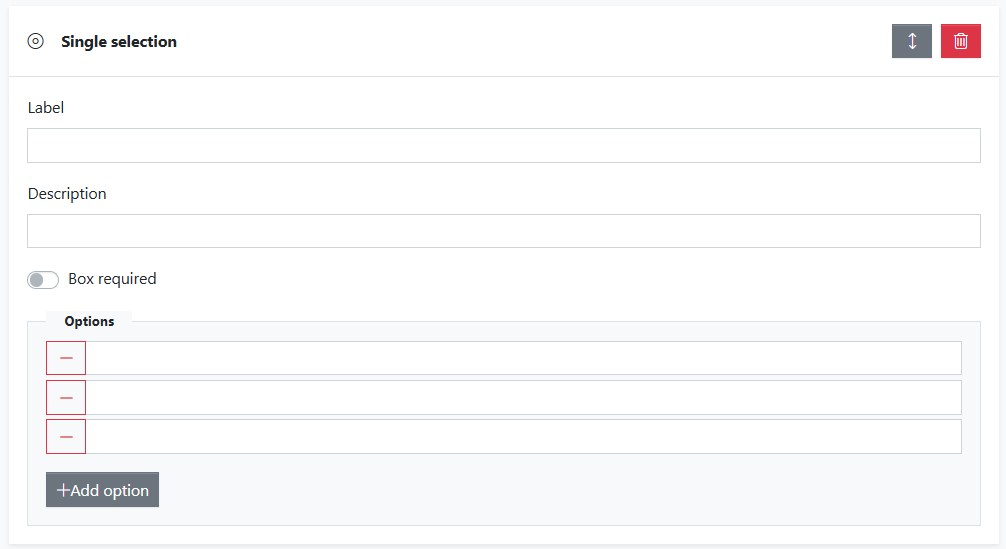
- Single Selection – You can add several options from which the user should choose one. You can modify the number of options by clicking the [+ Add Option] button to add a new one or by removing existing ones by clicking the red minus icon on the left.
- Multiple Selection – similar to the previous field, but this time the user can select several options at once.
- Dropdown Selection – again, the user chooses one option from many, but this time they are displayed in a dropdown menu.
- Date – the user selects a date from dropdown fields.
- Birthday – the user provides their birthdate using dropdown fields.
- Number – field for selecting a number (either by typing or using up/down buttons).
- Range – number within a specified range.
- Color – color selection from a HEX color panel.
- Country – country selection from an alphabetical list with search functionality.
- Language – language selection from an alphabetical list with search functionality.
- Currency – currency selection from an alphabetical list with search functionality.
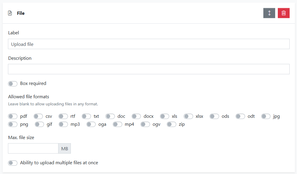
- File – the user can upload a file in an allowed format; you can also limit the maximum file size.
- Consent for Data Processing – With the option to modify the text of the clause.
- Separator – A horizontal line that allows you to separate forms elements.
- Static Content – Content visible in any segment of the form, which can be filled in and modified by the publisher.
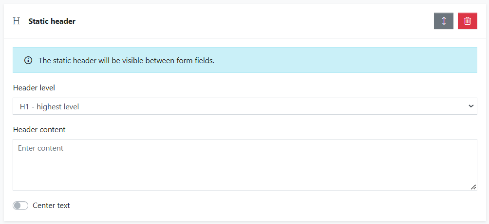
- Static Header – A header visible in any segment of the form, usually at the top, which can be filled in and modified by the publisher, with the option to change the header size.
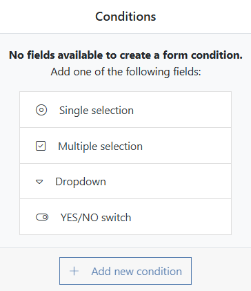
Conditions
When creating a Form, we can determine which fields the user will see based on their selections in conditional fields.
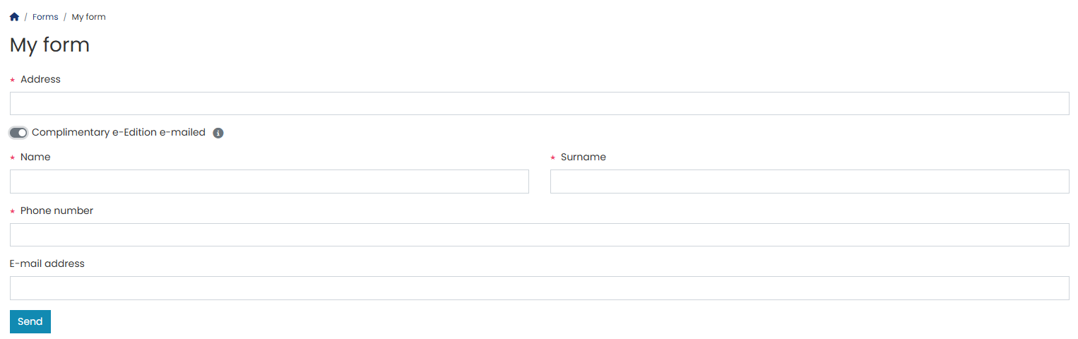
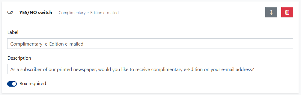
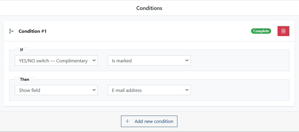
Let's explain the function of a conditional field with an example of a subscription to a printed newspaper, where the editorial team includes a free digital edition of the same newspaper.
We ask the user ordering a subscription to the printed newspaper to provide details necessary for shipping the newspaper. We can specify which data is required (e.g., address and surname).
If we want to use a condition, we choose its type from the four available options. The same conditions can also be selected from the full list of possible form fields.
Selecting at least one of these four types is necessary to continue creating the condition.
Let's complete the relevant fields:
add the remaining form fields that will be dependent on the condition:
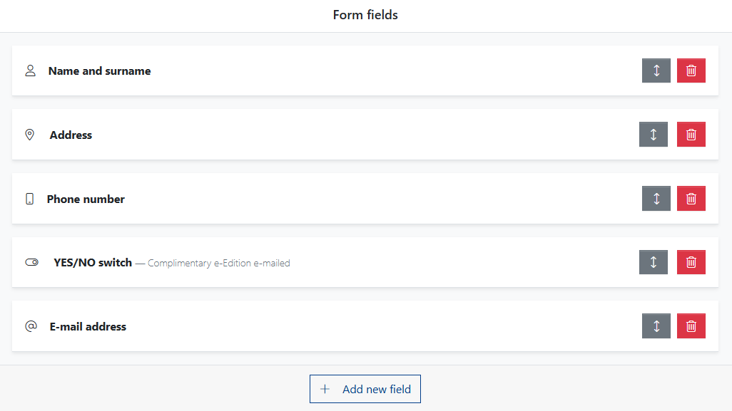
and create a condition that ensures if the user chooses to receive an additional digital edition, an email address field will be shown. Otherwise, this field will remain hidden.
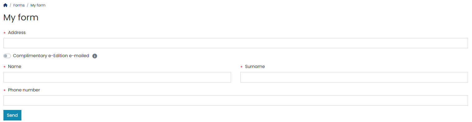
From the user’s perspective, depending on the choice made, the form will appear as follows:
User without e-edition:
User with e-edition: