 polski
 español

 Monika Borowiec
With the comments widget in CMS 4media, you can embed it into any template in your website's visualization (Page builder module). It can display comments from all modules or just one of them, such as articles, photo galleries, etc.
%20(1).png)
You can find detailed instructions on how to add a widget in CMS 4media here: Adding Widgets.
To have the widget display user comments, make sure that in the Comments settings, you have the option to add comments enabled. Learn more: Commenting Settings and the Comments Module in CMS 4media.
Header settings
Header text
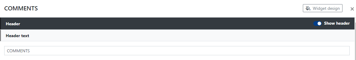
In the header settings, you can decide what text will be displayed in the widget's header. You can title it, for example, as "Recent Comments". If you wish, you can also disable the header's visibility - just slide the "Show Header" toggle to the left to display only the content within the widget.
Header link
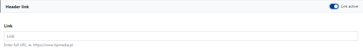
In this section, you can decide whether the widget's header text should function as a link. When the user clicks on the header text, they will be directed to the page you specify. To enable this feature, toggle the "Link active" switch to the right and paste the page's address.
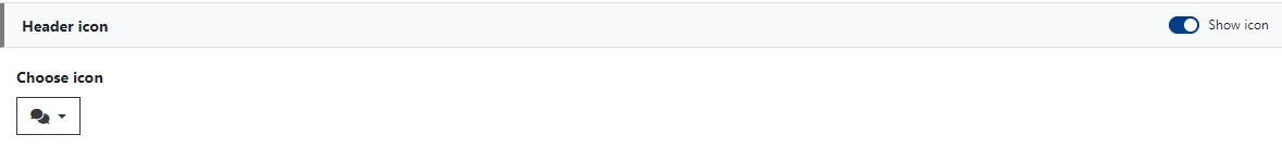
Icon in the header
If you'd like, you can enable or disable the visibility of an icon that can appear in front of the header text. It serves as an additional visual element that enhances the appearance of your local news website and catches users' attention.
You can choose the icon from the available icon library built-in in CMS 4media.
Header menu
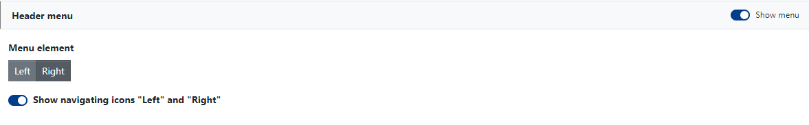
This feature allows you to enable scroll arrows within the widget's content. So, if you've set the widget to display only the last 2 comments, users on the website can use these arrows to scroll through those comments and display the next 2, and so on.
You can choose whether the navigation arrows are positioned on the left or right side. If you choose the left side, they will "adjoin" the header; if on the right, they will be located near the widget's right edge.
Content settings
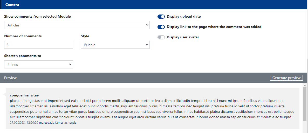
Show comments from selected module
Here, you will decide whether you want to display comments from all sections of your local news website where commenting is possible (option "All Modules"), or only from a specific location, e.g. from articles alone.
Number of comments
Decide on the number of comments you want to display in the widget. You can choose a range from 1 to 50 comments.
Style
Choose the presentation style for comments on your website. You have 3 options to choose from:
- Default
- Bubble
- Quote
In the "Preview" section, you'll be able to see how each style looks individually.
Shorten comments to
Some readers can sometimes write extensive comments. With this option, you can shorten the display of long comments. You can choose to shorten the comment to:
- 1 line,
- 2 lines,
- 3 lines,
- 4 lines.
You will immediately see the effects of your choice in the "Preview" section.
Display upload date
Using this switch, you can decide whether the date of addition should be displayed below the comment content in the format: DD.MM.YYYY, HH:MM:SS.
Display link to the page where the comment was added
Using this switch, you can decide whether a link to the article under which the comment was published should appear right below the comment, immediately after the comment's addition date. By toggling this switch, you will facilitate quick access for users to the content that sparks discussions on your website.
Show user avatar
Here, you will decide whether avatars, which are miniature profile pictures of the users who posted the comments, should be displayed alongside the comments.

