 polski
 español

 Jagoda Janczura
Whole Component Style
Font
- Font settings (size, type, thickness, color) will apply to the entire widget except for element titles. It is recommended to set the default font for element titles in the
Settings → Website View → Displaying → Default Header Font module
- Font settings in the "Whole Component Style" section have lower priority than the settings in the "Component Header" and/or "Component Content" sections. This means that if you set the font to Roboto in the "Whole Component Style" section and Poppins in the "Component Header" section, the headers in the widget will ultimately use the Poppins font.
Frame (border)
- You can set each border edge separately, allowing you to add borders on all sides or just the top or bottom.
- To display a border on the page, you must set the border color, thickness, and style.
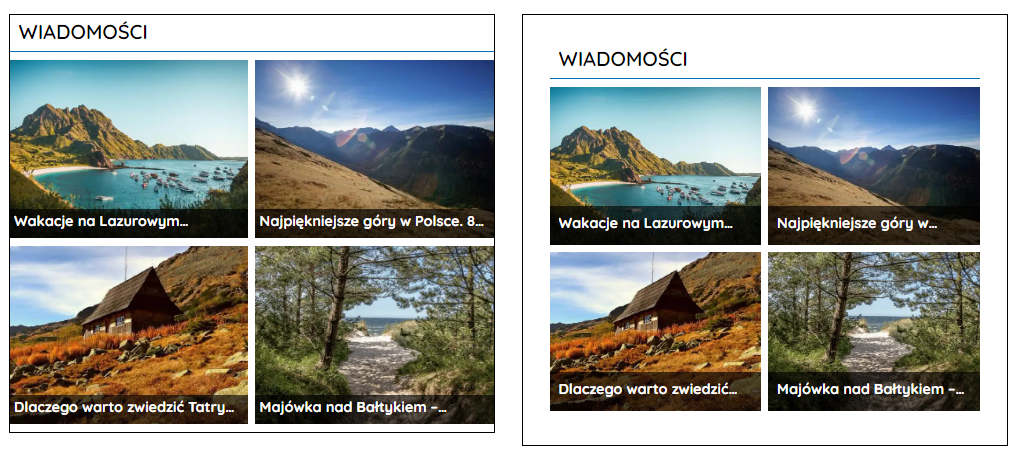
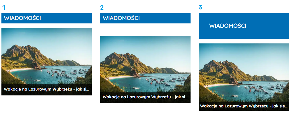
Spacing
- By setting inner spacing, you determine the distance between the header and content from the widget's edges. On the left, there is a widget without set spacing, and on the right, it has 30px spacing on each side.
Component Header
Header Style
Font
- Font settings in the "Header Style" section have lower priority than the settings in the "Header Icon" and/or "Header Text" sections. This means that if you set white as the color in the "Header Style" section and black in the "Header Text" section, the text in the widget's header will ultimately be black.
Frame (border)
- You can set each border edge separately, allowing you to add borders on all sides or just the top or bottom.
- To display a border on the page, you must set the border color, thickness, and style.
Spacing
- By setting inner spacing, you determine the distance between the text and icon from the header's edges.
- By setting an outer bottom margin, you determine the distance of the header from the widget's content.
1. Header without set spacing.
2. Header with a 30px outer margin.
3. Header with 30px inner spacing on each side.
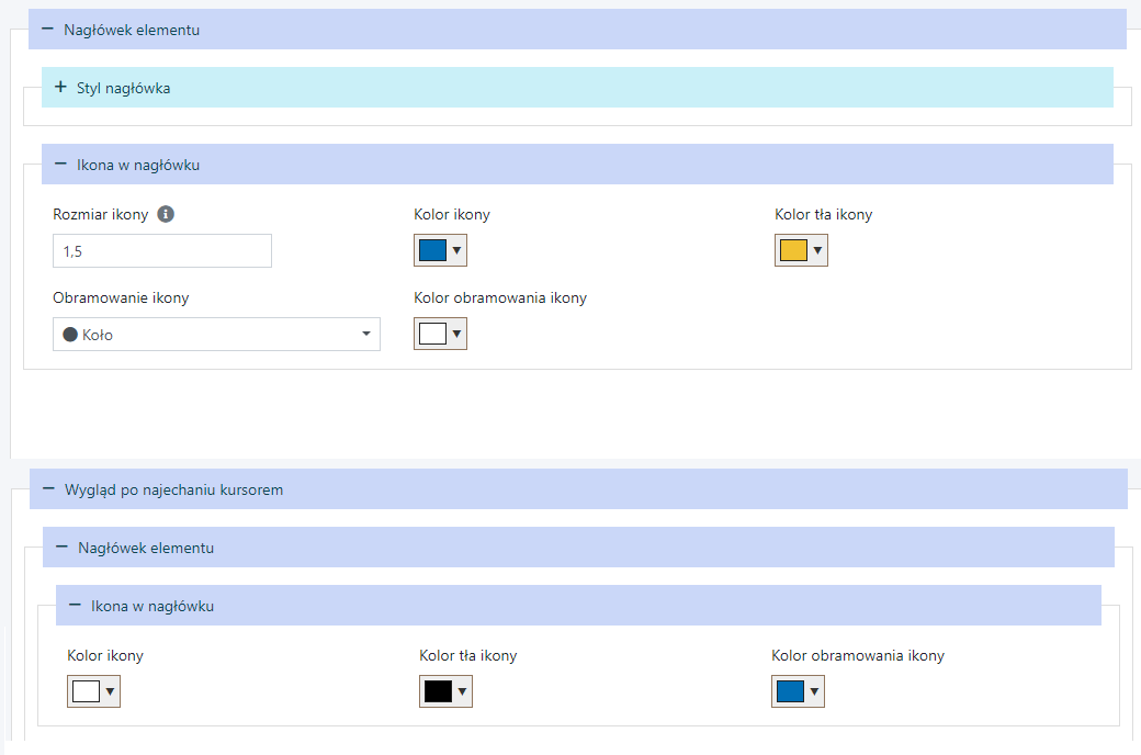
Header Icon
Icon framing
- To add framing to an icon, you need to choose the border color and shape.
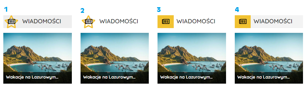
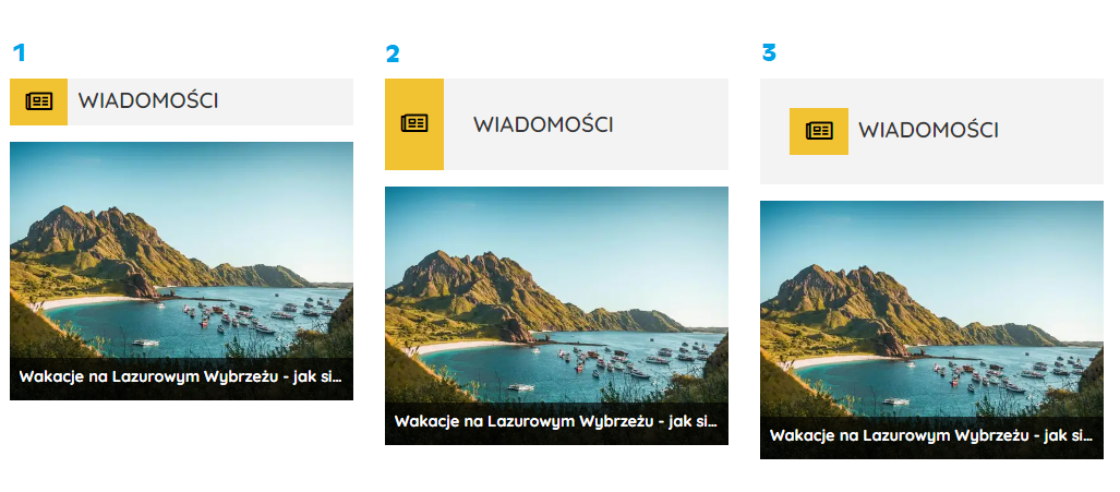
1. Icon with "Star" framing and a gray header background.
2. Icon with "Star" framing.
3. Icon with a yellow background.
4. Header with a yellow background for the icon and a gray header background.
Header Text
Background Color and Framing (Border)
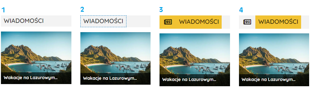
1. Text in the header without a set color and with a gray header background
2. Text in the header with "Dashed Line" framing on each side and a gray header background
3. Header with a yellow background for the text in the header, yellow background for the icon, and a gray header background
4. Header with a yellow background for the text in the header and a gray header background.
Spacing
- By setting inner spacing, you determine the distance between the text and icon from the header's edges.
1. Header without set spacing
2. Text in the header with 30px spacing on each side (in the "Header Text" section)
3. Header with 30px spacing on each side (in the "Header Style" section).
Header Menu
Whole Menu Style
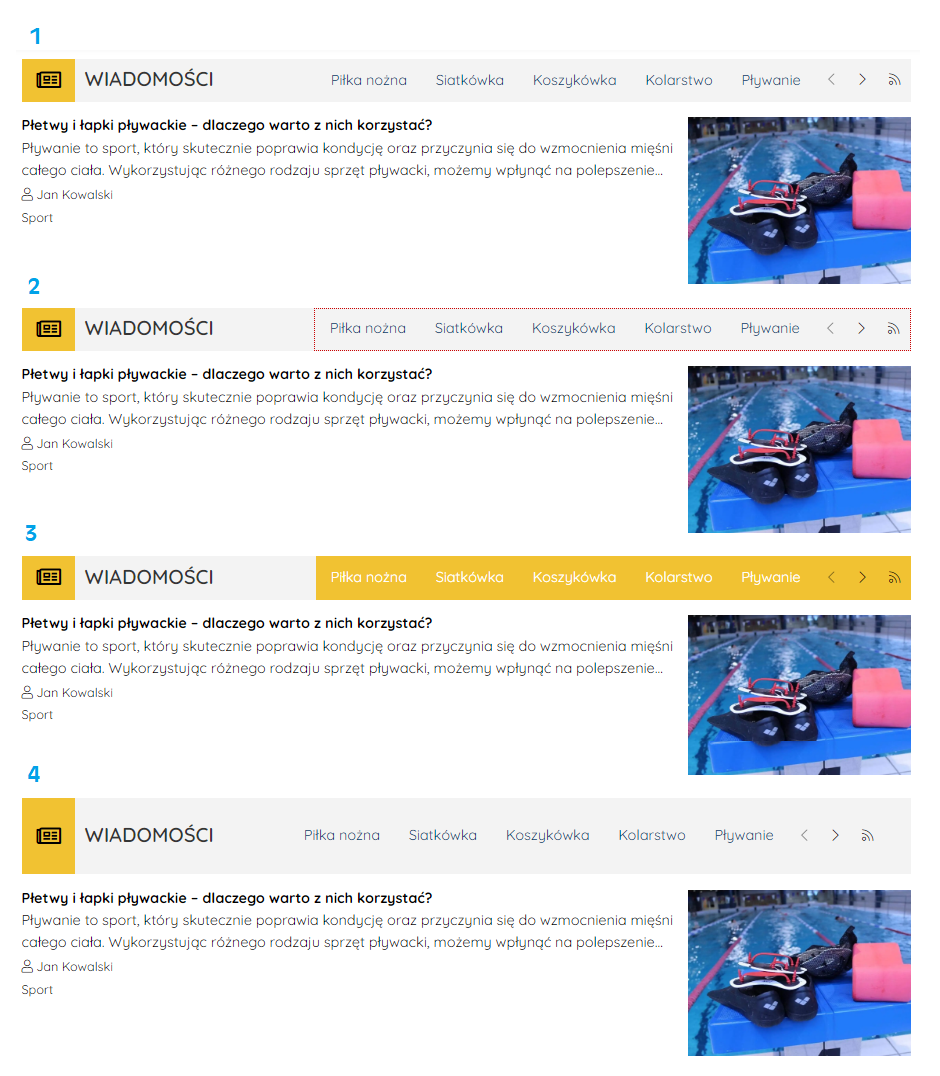
1. Menu in the header without a background, framing, or spacing
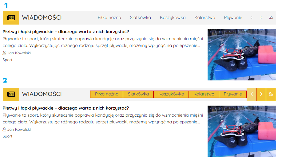
2. Menu in the header with "Dotted Line" framing
3. Menu in the header with a yellow background
4. Menu in the header with 30px spacing on each side.
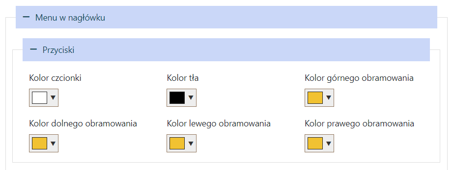
Buttons
1. Buttons without a set background color, framing, or font color.
2. Buttons with a yellow background, framing on each side, and white font.
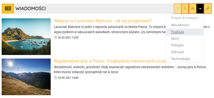
Dropdown Menu
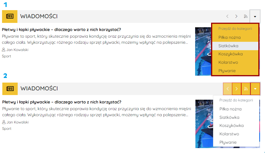
1. Dropdown menu with a yellow background and framing on each side.
2. Dropdown menu without a background and framing, with a yellow background for the buttons.
Component Content
Content Style
Settings pertain to the content of elements and do not affect the widget's header.
The font type set in this section has lower priority than the Default Header Font (Settings → Website View → Displaying → Default Header Font) and the settings in the "Title Style" section.
Below are the settings from this section and their appearance on the page. The default header font was set as Noto Sans JP (Settings → Website View → Displaying → Default Header Font), while no font type was set in the "Title Style" section.
.png)
Title Style
Settings in this section apply to element titles (article titles, events, companies, etc.) and have the highest priority.
Below is an example of a widget in which the "Title Style" section was set to use the Montserrat font. The font is bold and colored yellow. This font is displayed on the website.
.png)
Component Settings
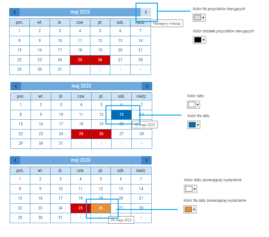
Events Calendar
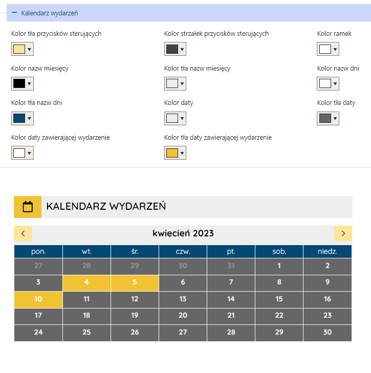
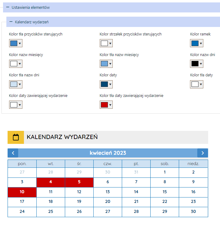
Important! The color of day names has lower priority than the color settings in the "Content Style" and "Whole Component Style" sections.
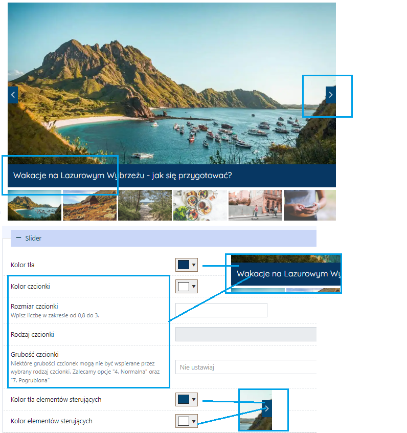
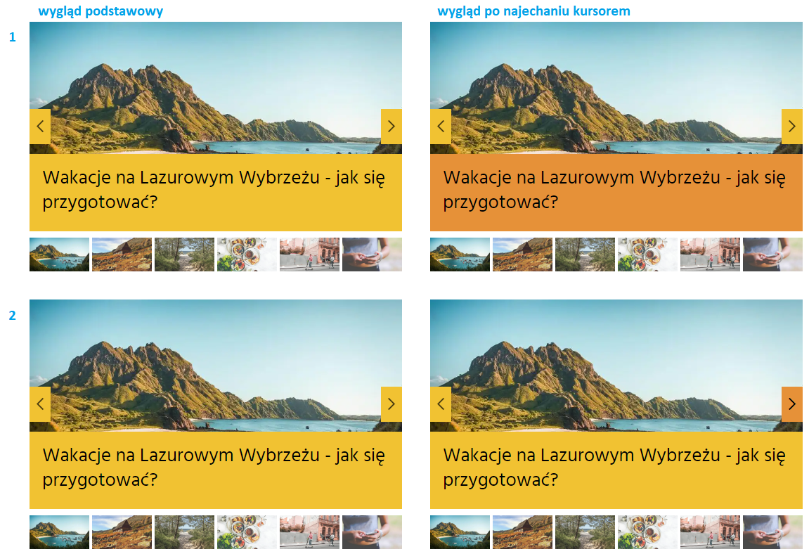
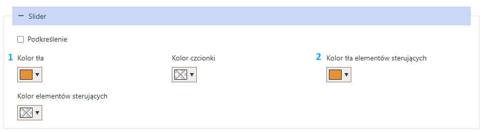
Slider
If the font type is not set in this section, it will be taken from the "Content Style" section. If the "Content Style" section does not have a font type set, it will be taken from the "Whole Component Style" section
Countdown
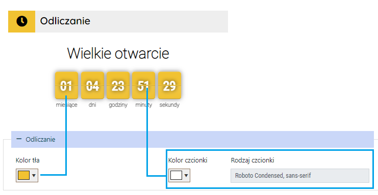
Font settings for the label above the countdown and words like "months," "days"... are taken from the "Content Style" section. If the "Content Style" section does not have font type, color, etc., set, it will be taken from the "Whole Component Style" section.
List of other articles
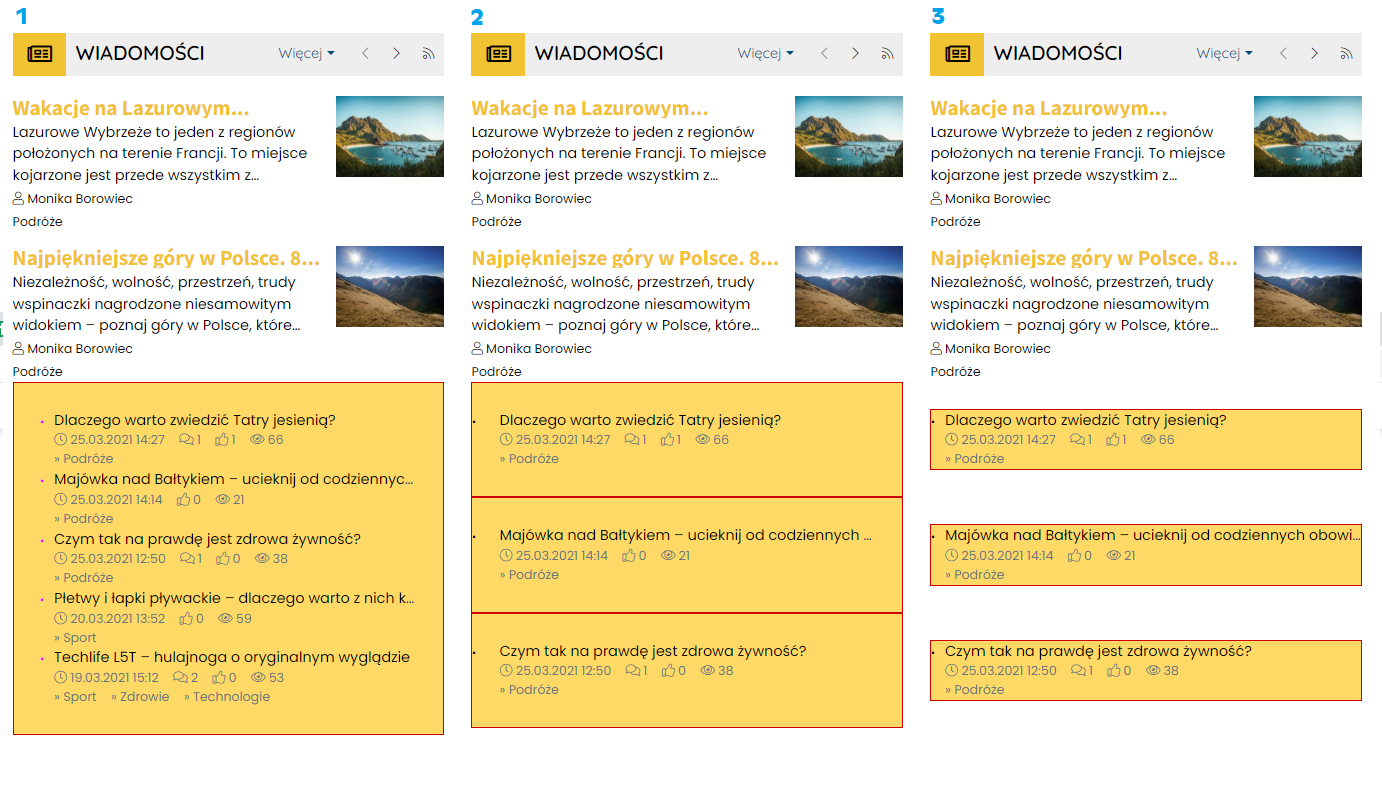
1. List of news with settings in the "List of Other Articles" section → Content Style: yellow background color, red framing on each side, 30px inner spacing.
2. List of news with settings in the "List of Other Articles" section → Single Item Appearance → Content Style: yellow background color, red framing on each side, 30px inner spacing.
3. List of news with settings in the "List of Other Articles" section → Single Item Appearance → Content Style: yellow background color, red framing on each side, 30px external spacing.
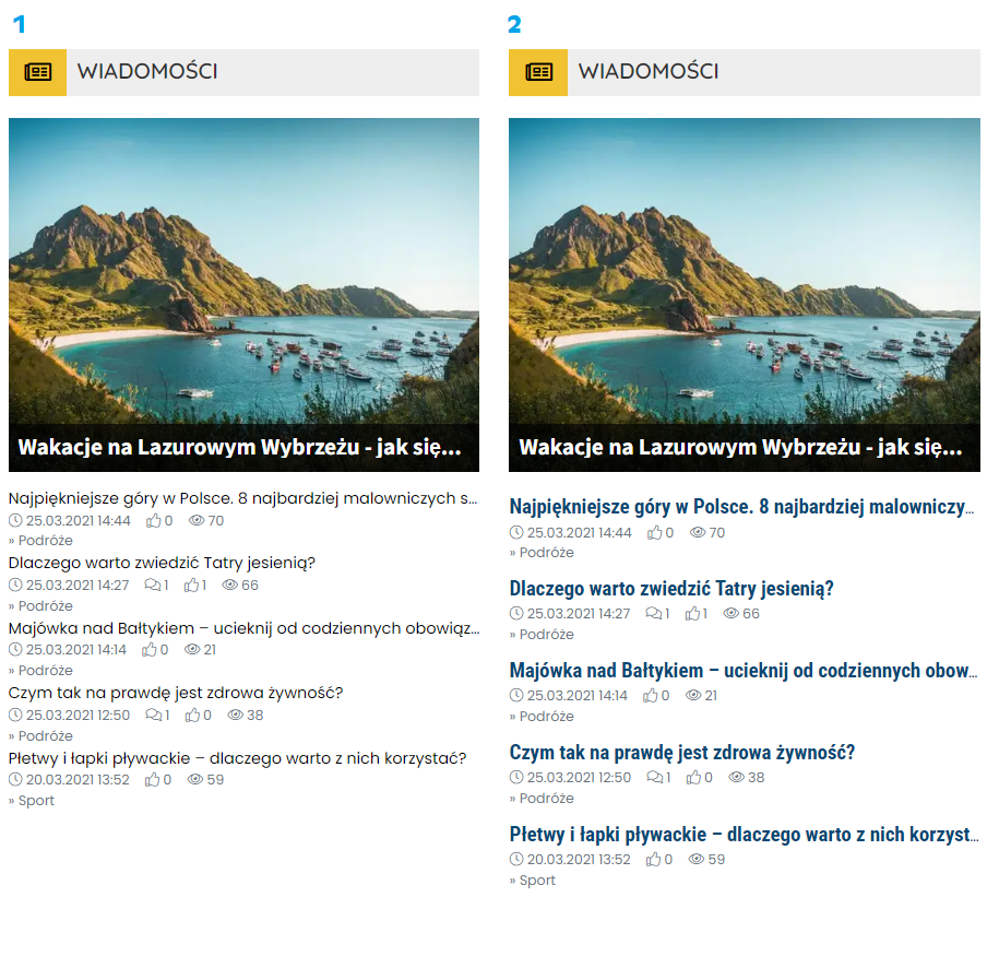
1. List of news without additional settings
2. List of news with settings in the "List of Other Articles" section → Single Item Appearance → Title Style: increased font size, bold, and changed font type.
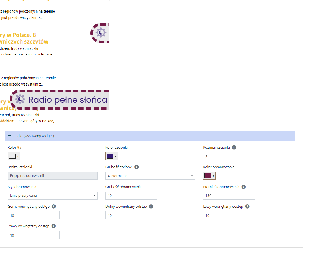
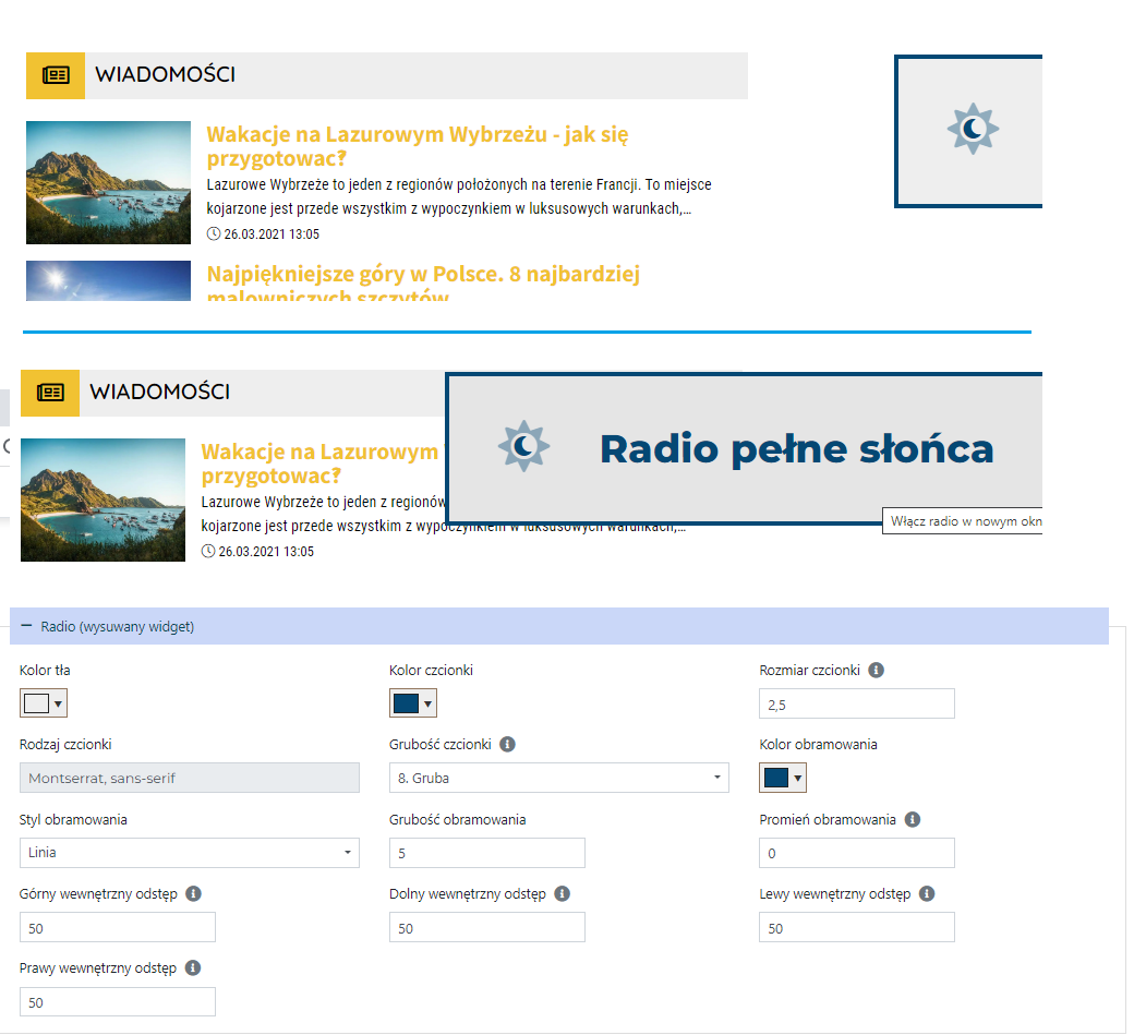
Radio (slide-out widget)
Additional Settings
Layer Over The Photo
.png)
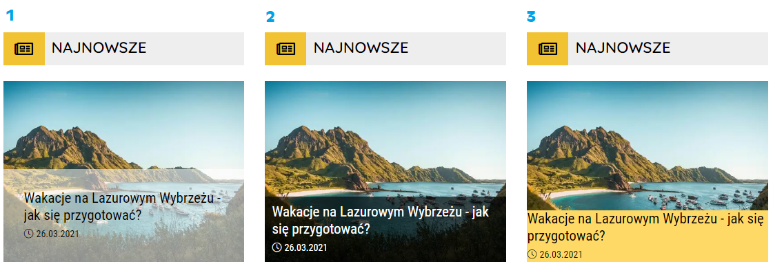
1. Layer over the photo with a black font color, partially transparent white background, and 30px spacing on each side.
2. Layer over the photo with a white font color, partially transparent black background, and 10px spacing on each side.
3. Layer over the photo with a black font color, yellow background, and no spacing on any side.
Important! The layer over the photo settings in the "Component Content" section → Additional Settings → Layer Over The Photo do not affect the slider.
Editing the layer over the photo in the slider is available in the "Component Content" section → Component Settings → Slider.
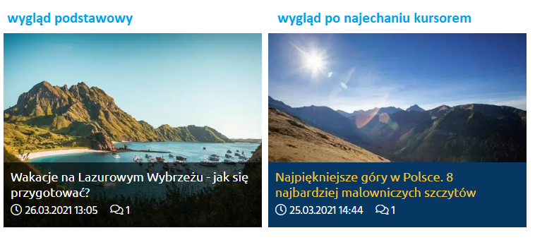
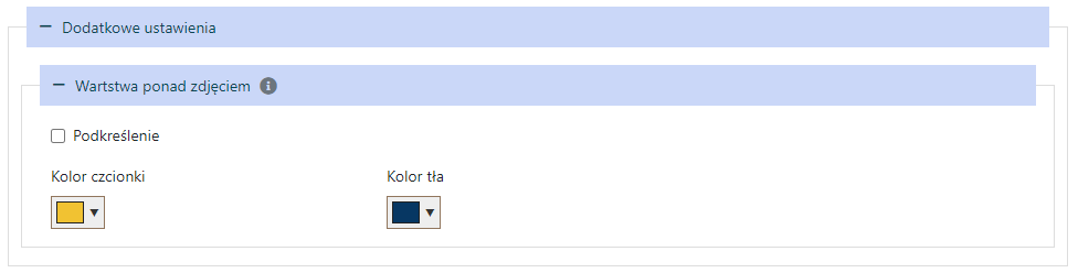
Hover View
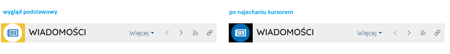
Component Header
Header Icon
You can change the icon color, icon background color, and icon border color on hover.
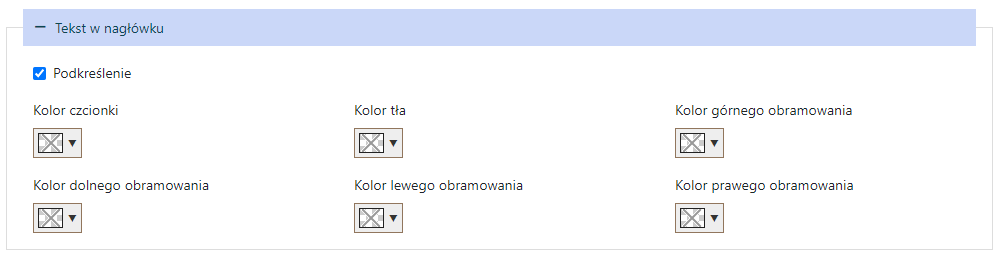
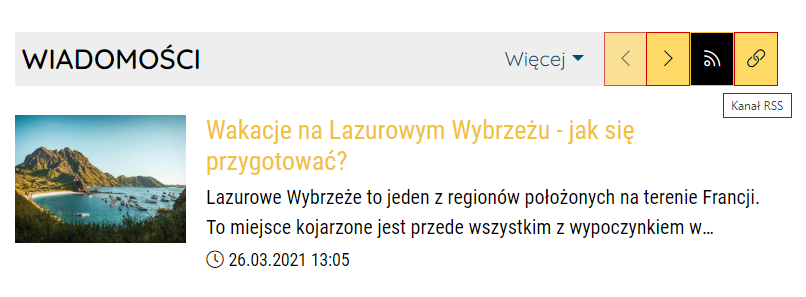
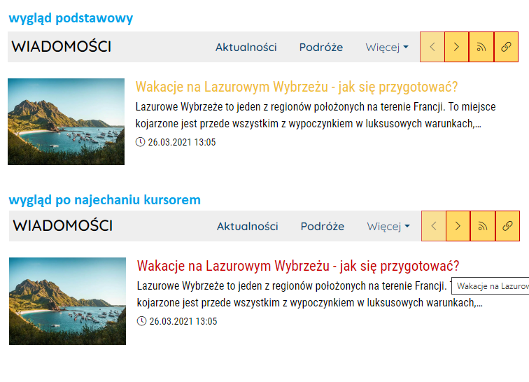
Header Text
You can change the font color, text background color, and text border color on hover over the header.

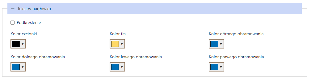
You can also set text underlining on hover over the header:

Header Menu
Buttons
You can change the font color, background color, and border color of the menu buttons in the headers on hover.
Dropdown Menu Links
You can change the font color of the text and the background color of the dropdown menu links on hover:
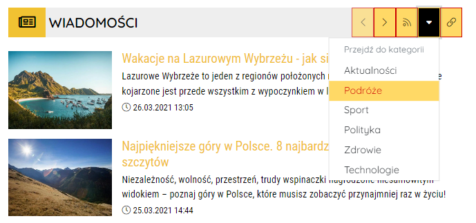
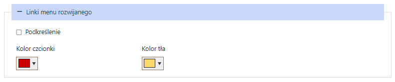
You can also set text underlining for the dropdown menu text on hover:
Component Content
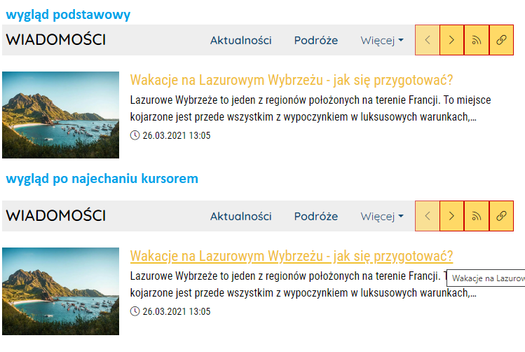
Title Style
You can change the font color of the title on hover.
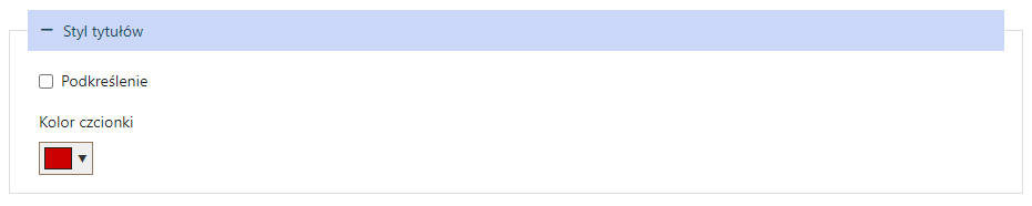
You can also set title underlining on hover:
Component Settings
Events Calendar
Slider
Additional Settings
Layer Over The Photo