 polski
 español

 Monika Borowiec
The widget showcases top rated articles published on your local news website, those that have resonated the most with readers. Articles with the highest number of votes (thumbs up) in the "Rate" section below the article will be displayed at the top positions.
Adding the Widget
You can add the Popular Widget to any template in the Page Builder module.
To do this, log in to the Administrator account in CMS 4media, select the "Page Visualization" module from the main menu.
Then choose the template to which you want to add the widget and click the "Edit" button.
The template editor will open, where you'll see the added widgets and column layout. Click the "+Add Item" button where you want the Popular Widget to appear (you can later change its position by drag&drop after saving changes).
The widget library will open. Locate the Popular Widget in it (you can use the search function). Clicking will open the widget configuration window.
Watch a step-by-step video tutorial with textual instructions on how to add a widget: Adding Widgets.
Widget Configuration
Like all other widgets in CMS 4media, this one consists of header and content settings.
Header
In the header settings, you decide whether there should be a bar with additional information and buttons above the widget's content. If you want the widget to display only the content, you can uncheck "Show Header." Similarly, you can decide on displaying each element in the header settings.
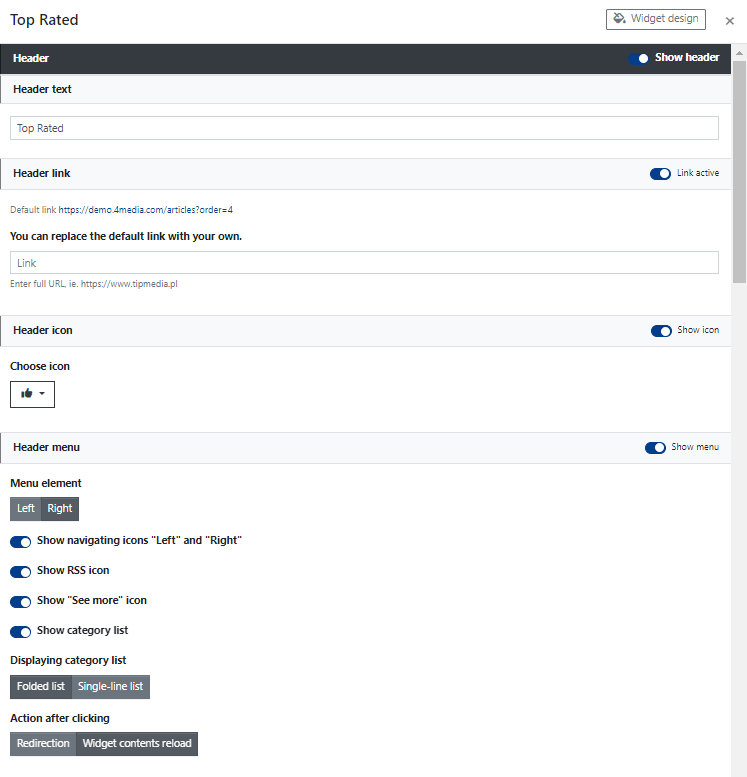
Header Text - you can enter a short text here, e.g., "Most Popular," "What's Trending," etc., which will be displayed on the header bar above the content. It can act as a link if you activate the Header Link.
Header Link - allows linking the Header Text; if active, it redirects users to a subpage with the most popular articles by default. You can also paste your own link.
Header Icon - displayed before the Header Text. You can change it by selecting another icon from the CMS 4media built-in library.
Header Menu - allows enabling additional buttons on the menu bar, displayed after the Header Text:
- Menu Element - menu position - on the left or right side; allows setting the position of additional icons displayed on the header bar - on the left, right after the Header Text, or on the right, at the end of the header bar.
- Show navigating icons "Left" and "Right" - displays left and right control arrows (forward and backward); users can scroll the widget's content with them (to see next articles).
- Show RSS Icon - allows displaying an RSS channel icon, functions as a link to the channel.
- Show "Read More" Icon - activates a link (chain) icon; when clicked, the user is redirected to a subpage with articles.
- Show Category List - displays an icon of the category list on the header bar, from which users can choose a different article category and display them in the widget. With the following options, you can customize its appearance and functionality to your preferences:
- Displaying Category List:
- Folded List - displays only the dropdown list icon on the header bar; users, when clicked, see other categories they can choose, and by clicking, display articles from a specific category on a new subpage or directly in the widget (see: Action After Clicking).
- Single Line List - displays the "More" button with a dropdown list icon, from which users can choose a category after expanding; clicking on a category redirects the user to a subpage with articles published in that category or displays them in the widget (see: Action After Clicling).
- Action After Clicking:
- Redirection - clicking on the category name redirects the user to a subpage with articles published in that category.
- Widget Content Reload - choosing a category changes the content of the widget; articles from the category selected by the user will be displayed in the widget.
- Displaying Category List:
Content
In the Content section, you will set the categories from which articles will be displayed in the widget and the way they will be displayed.
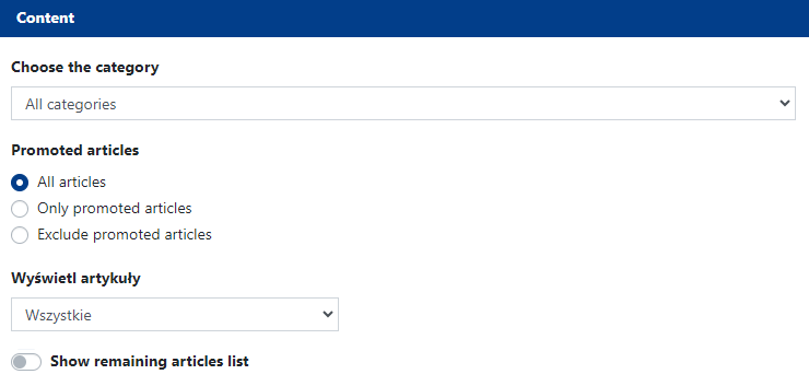
Choose the Category - the dropdown list contains all categories created by you or your team of editors and journalists. You can select all categories or only one (including a subcategory) to be displayed in the widget.
Promoted Articles - allows deciding what type of articles should be displayed in the widget. These can be all articles, only featured ones, or you can completely exclude articles marked as "Featured" from being displayed in the widget (see: Articles module).
Display Articles - here you can decide whether all articles should be displayed in the widget, only those with a main photo or without a main photo.
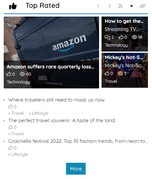
Show Remaining Articles List - enables displaying an additional list of articles below the tiles of articles set as main. Then the Popular Widget may look like the screenshot below:
Activating this switch will reveal additional options for configuring the content of the widget:
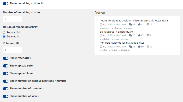
Number of Remaining Articles - allows specifying the number of articles displayed on the list (no more than 50).
Design of Remaining Articles - a regular list (each item on the list simply starts with the title of the article) or bulleted (the title of the article on the list is preceded by a bullet point).
Column Split - here you can decide whether the list of articles should be divided into columns (max 3). Useful if you want to display several dozen articles and at the same time prevent the widget's content from "lengthening" down.
Show Categories - displays the category name on the header bar under the article title, from which the article was published.
Show Upload Date - displays the publication date of the article under the article title.
Show Upload Hour - displays the publication time of the article under the article title.
Show Number of Positive Reactions (thumbs up) - displays the number of positive votes (thumbs up) cast by users on the article's subpage.
Show Number of Comments - displays the number of published comments under the article.
Show Number of Views - displays the total number of article views.
All changes you make here will be previewed in real-time in the "Preview" window.
Displaying Results
In this part of the Popular Widget Content Settings, you decide how the main articles should be displayed (e.g., in tile form).
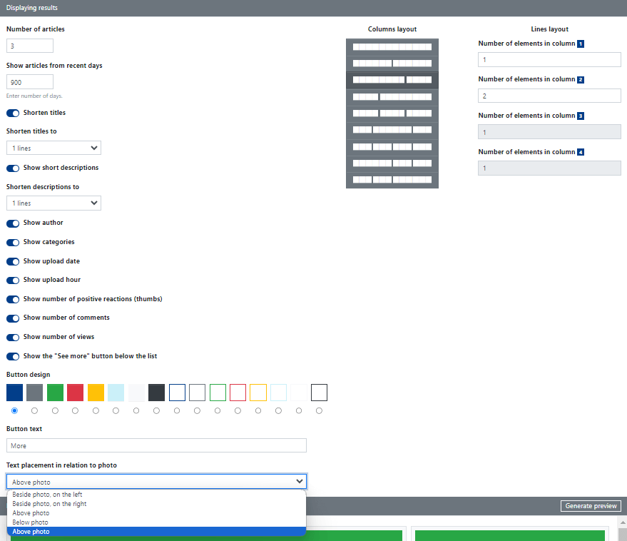
Number of Articles - max. 50, determines the number of articles displayed in the widget.
Show Articles from Recent Days - allows specifying the number of days (counted from the current date) in which articles were published.
Shorten Titles - allows choosing one of 4 predefined options for shortening titles - to 1, 2, 3, or 4 lines. Useful if some article titles are very long and would overly cover the thumbnail (main photo) of the article.
Show Short Descriptions - like titles, descriptions can also be shortened to 1, 2, 3, or 4 lines of text.
Show Author - displays the author's first and last name.
Show Categories - displays the name of the category in which the article was published.
Show Upload Date - displays the publication date of the article on the portal.
Show Upload Hour - displays the publication time of the article on the portal.
Show Number of Positive Reactions (thumbs up) - displays the number of votes - thumbs up - cast by users in the "Rate" section below the published article.
Show Number of Comments - displays the number of comments posted under the article.
Show Number of Views - displays the total number of article views.
Show "Read More" Button below the List - allows choosing the appearance of the button and entering the text to be displayed on the button, e.g., Read More. When clicked, the user will be redirected to a subpage with articles.
Text Placement in Relation to Photo - allows choosing one of 5 layouts for text and photo, e.g., text displayed to the left of the main photo, to the right, on top, below, or above (on a semi-transparent bar overlapping the main photo).
Column Layout and Lines Layout
In the Popular Widget Content Settings, there are also settings for columns and row layout. With these settings, you can adjust the appearance of the widget to the layout of the page where you added the widget.
You can preview how the widget will look and the layout of columns and rows in the "Preview" section at the bottom of the widget configuration window.
For the best visual effect, take a moment to check various layouts to customize the widget's appearance to your needs.
The fields that have the greatest impact on how the tiles in the Popular Widget are displayed are:
- number of articles,
- text placement in relation to photo.
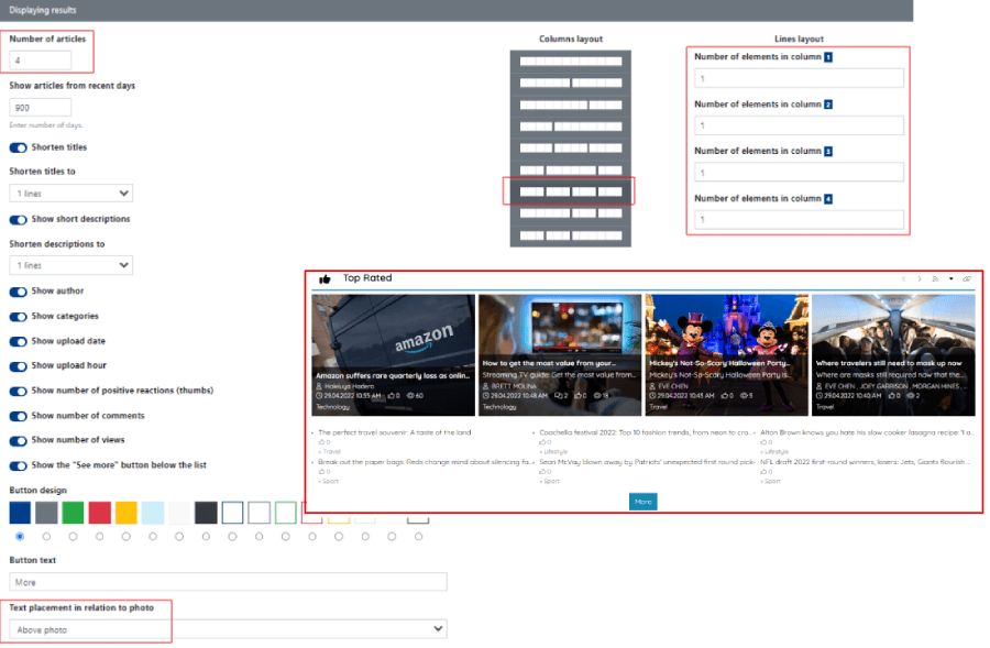
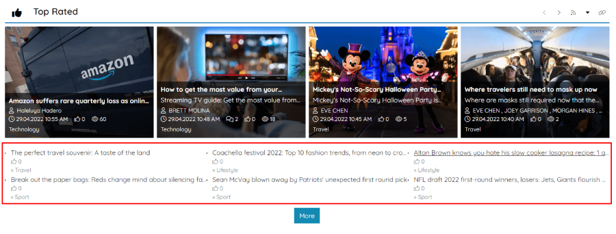
See the screenshot below for an example of how the widget might look:
- number of articles = 4
- text position in relation to photo = above the photo
- column layout = 4 columns
- number of elements in column 1 = 1
- number of elements in column 2 = 1
- number of elements in column 3 = 1
- number of elements in column 4 = 1