 polski
 español

 Monika Borowiec
The Most read widget in CMS 4media shows published articles and sorts them from the highest to the lowest based on the number of views. In practice, this means that the article with the highest total views on the website will be displayed first.
Adding the widget
You can add the widget in the Page builder module to any template. You can even add multiple Most read widgets, each configured differently.
To add a widget you must:
- Log in to the administrator account in CMS 4media.
- From the main menu, select the Page builder module.
- In the template list, choose the one to which you want to add the widget and click the "Edit" button.
- Then, where you want to add the widget, click the "+Add Item" button. You can later change its position by dragging it elsewhere.
- After clicking the "+Add Item" button, the CMS 4media widget library window will open.
- Find the Most read widget and click on it to go to the content configuration.
Watch the video tutorial: Adding a widget.
Configuring the Most read widget
Configuration is almost identical to the Popular widget. It consists of header section settings and content settings.
Header
Header settings are used to decide whether you want a bar with text and additional icons (acting as buttons/links) to be displayed above the widget content.
You can choose not to display the entire header or individual elements by clicking on the relevant switches, such as "Show header." You can edit the widget at any time and enable/disable their display.
You can also customize the widget's appearance by setting advanced options available by clicking on "Widget appearance". You can read more about this in the guide: Default widget appearance.
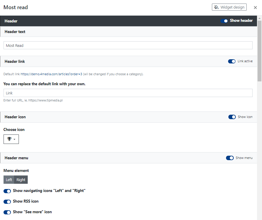
In header settings, you decide on:
Header text: the text displayed on the bar above the articles displayed in the widget. You can enter a short text that will guide readers on the type of articles they are looking at, for example, "Most read," etc.
Header link: if you activate this field, the Header text will function as a link by default. Clicking on the Header text will redirect the user to a subpage with a list of articles sorted by "Most read." You can also paste your own link.
Header icon: displayed before the Header text and also acts as a link. You can change the appearance of the icon by selecting another one from the dropdown icon list.
Header menu: you can enable the display of additional control icons, which will be displayed on the bar along with the Header text. These include:
- Menu element (position): on the left (starts right after the Header text) or on the right (aligned to the right edge of the header bar).
- Show navigating icons "Left" and "Right": displays left/right control icons, allowing users to scroll the widget content (display next articles).
- Show RSS icon: displays the RSS channel icon, acting as a link redirecting to the channel subpage.
- Show "See more" icon: displays the link icon, acting as a "See more" button, redirecting to a subpage with a list of most read articles published on the website.
Content
In content settings, you decide which articles will be displayed in the widget and how.
Start by selecting the categories from which articles should be displayed in the widget.
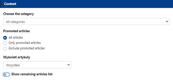
Choose the category - all categories created in CMS 4media in which articles have been published will appear on this dropdown list. You can choose all categories, one main category, or any subcategory.
Promoted articles - here you decide whether the widget should display promoted articles (marked as promoted in the article settings, see guide: Articles module).
Display articles - here you decide whether only articles containing a main (thumbnail) image, all articles (with or without a main image), or articles without a main image should be displayed.
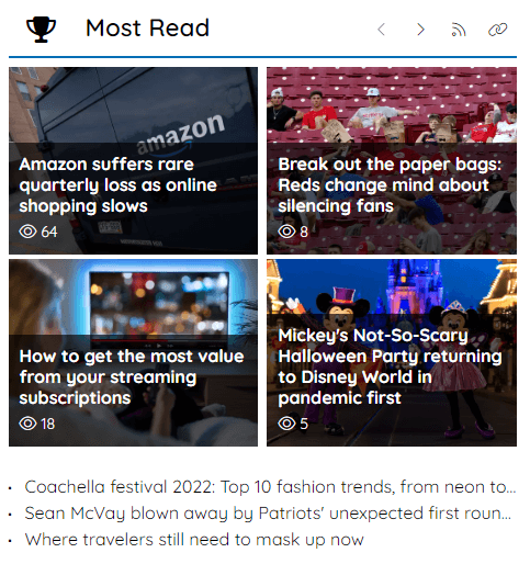
Show remaining articles list - activating this switch will display an additional list of remaining articles at the bottom of the widget. It may look like this, as shown in the screenshot below:
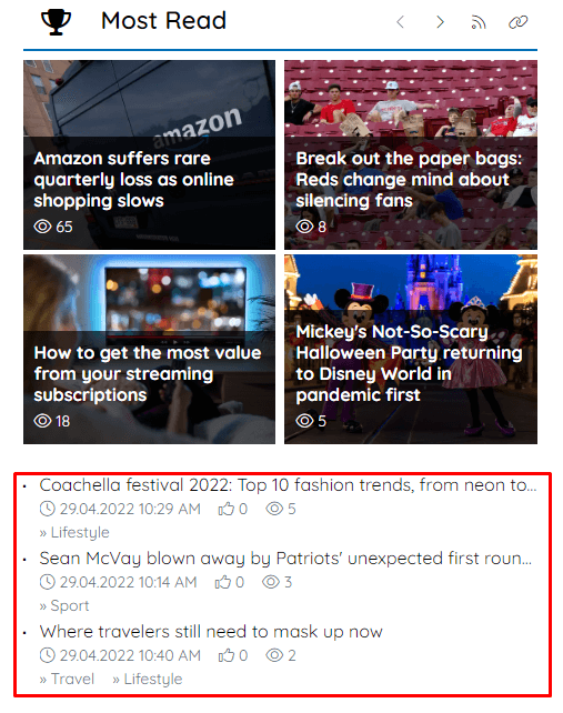
Clicking on the "Show remaining articles list" switch will expand additional options, allowing you to customize the information accompanying the article titles. Article titles visible on the list, of course, function as links - redirecting users to the article subpage.
Here you can set:
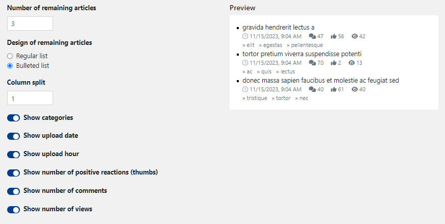
Number of remaining articles - max. 50, but it's better not to overdo the quantity to maintain the clarity and neatness of the widget. It determines the number of displayed articles on the list.
Design of remaining articles - a regular list (not preceded by any character or graphic highlight) or a bulleted list (article title preceded by a bullet point).
Column split - max. 3 columns, determines the division of displayed articles on the list into columns, so it's worth entering numbers in the "Number of remaining articles" field to ensure each column has the same length.
Show categories - displays the category name or the entire path to the subcategory in which the article was published.
Show upload date - displays information about the upload date below the article title in the format DD.MM.YYYY.
Show upload hour - this slider appears when you activate "Show upload date"; it is used to display information about the publication date of the article below the title in the format HH:MM.
Show the number of positive reactions (thumbs up) - displays an upward thumbs icon along with the numerical value of positive ratings given by users on the article subpage.
Show the number of comments - displays a speech bubble icon along with the number of comments published by users under the article.
Show the number of views - displays the total number of views of the article, i.e., how many times users visited the article subpage.
Preview - continuously displays how the list of articles will look while setting all the options described above.
Displaying results
In this part of the Most read widget content settings, you set how articles should be displayed - both in terms of their number, appearance, and accompanying information.
Here you can set:
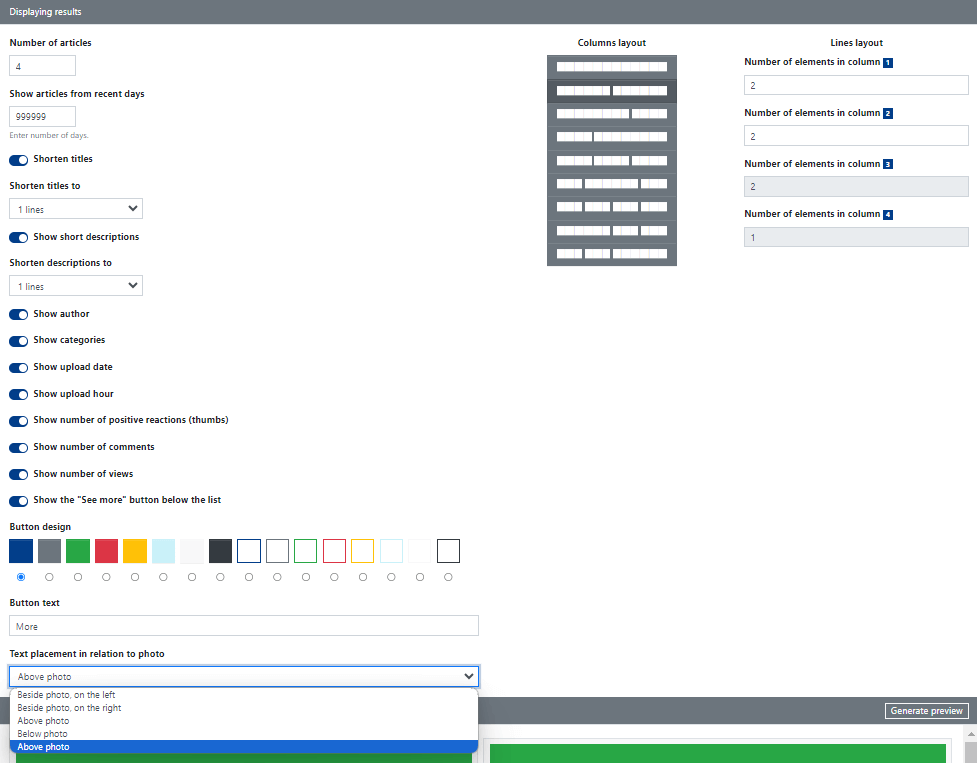
Number of articles - no more than 50; determines how many articles will be displayed in the widget.
Show articles from recent days - here you enter the number of days (counted from the current day), i.e., the range of days from which the widget should display articles in the widget.
Shorten titles - you can choose whether you want article titles to be shortened; from the dropdown list, you can choose to shorten titles to 1, 2, 3, or 4 lines.
Show short descriptions - you can decide whether to display article descriptions; this is the lead entered in the Introduction field during article editing (see: Articles module). Here, you can also choose from the dropdown list how to shorten - to 1, 2, 3, or 4 lines.
Show author - displays the first and last name of the article's author.
Show categories - displays the category name or the full path leading to the subcategory in which the article was published
Show upload date - displays information about the upload date below the article title in the format DD.MM.YYYY.
Show upload hour - this slider appears when you activate "Show upload date"; it is used to display information about the publication date of the article below the title in the format HH:MM.
Show the number of positive reactions (thumbs up) - displays an upward thumbs icon along with the numerical value of positive ratings given by users on the article subpage.
Show the number of comments - displays a speech bubble icon along with the number of comments published by users under the article.
Show the number of views - displays the total number of views of the article, i.e., how many times users visited the article subpage.
Show the "See more" button below the list - displays the button at the bottom of the widget and allows you to specify its appearance and set the button text. Clicking the button redirects users to a subpage with a list of articles sorted by the highest number of views (i.e., Most read in filtering options).
Text placement in relation to the photo - here, the main decision is made about the layout of text and photos; you can choose whether the article's photo (thumbnail) should be displayed on the left, right, top, bottom, or with a special semi-transparent bar on which information will be displayed (the "Above the photo" option).
Columns and Lines Layout
Columns and lines (rows) layout in Most read widget content settings determines the layout of articles to be displayed. All changes you make in this section will be generated in real-time in the "Preview" section at the bottom of the widget configuration window - so you can preview the widget's appearance before saving changes.
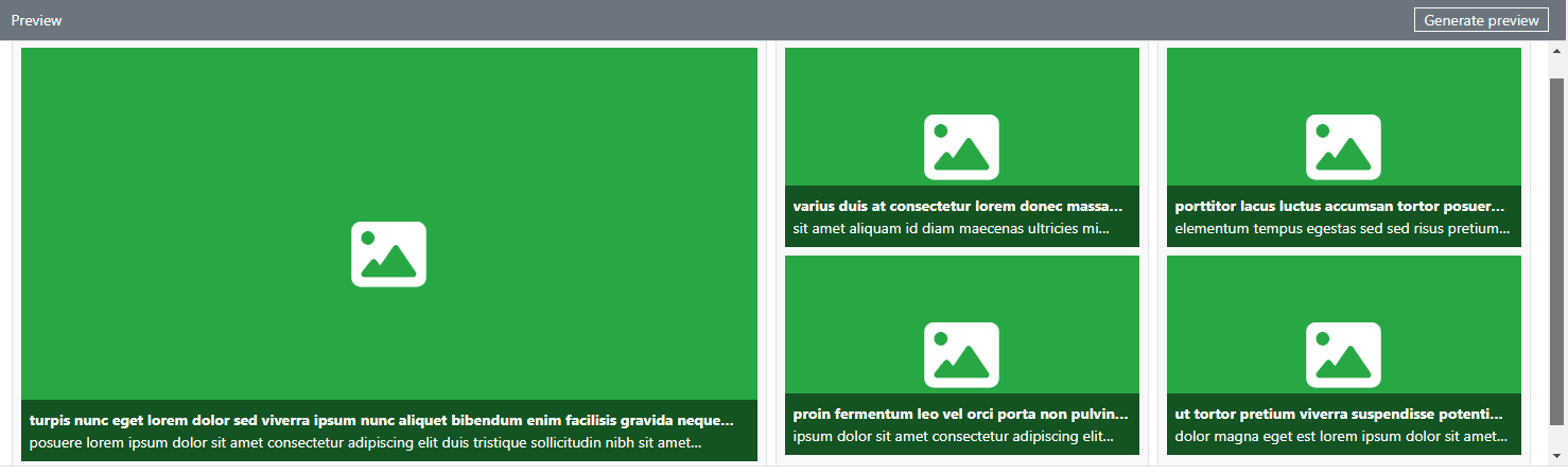
In the screenshot below, you can see how the Preview of articles will look for the following settings:
- number of articles = 5
- text placement in relation to the photo = Above the photo
- columns layout = 3 columns (2/4 + 1/4 + 1/4)
- lines layout:
- number of items in column 1 = 1
- number of items in column 1 = 2
- number of items in column 1 = 2