 polski
 español

 Monika Borowiec
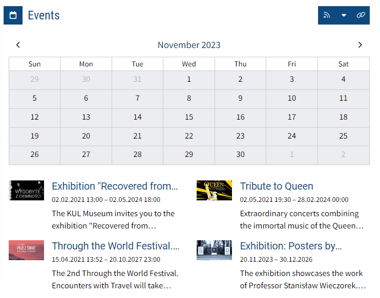
The Events Calendar Widget in CMS 4media shows the calendar for the current month and (if desired) a list of upcoming events. Users can see what's happening in your city, and by clicking on a specific date, they will be redirected to the events subpage with filtering for that particular day.
The calendar can also be scrolled forward to select a different date and view upcoming events.
Adding the Widget
You can add the Events Calendar Widget in the Page Builder module to any template. Important! Only one Events Calendar Widget can be added to a page template.
To add the widget:
- Log in to the admin dashboard in CMS 4media.
- Select the Page Builder module from the main menu.
- Choose the template to which you want to add the widget and click "Edit".
- Click the "+Add Item" button where you want to add the widget. You can later rearrange its position by dragging it elsewhere.
- After clicking "+Add Item," the CMS 4media widget library window will open. Locate the Events Calendar Widget and click on it to go to the content configuration.
Watch the video tutorial: Adding the Widget.
If you need advanced widget appearance options, click the "Widget Design" button. There, you can set elements such as spacing, shadows, custom CSS classes, or actions on hovering over a specific element. More information can be found in the guide: Default Widget Design.
Header Settings
In this section, you decide whether additional elements should appear above the calendar view, such as Header Text or control icons that link to other locations.
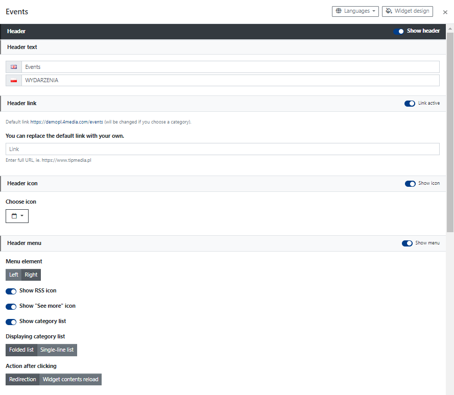
You can activate or deactivate each element by clicking on the corresponding switch.
If you decide to activate all elements, you can set:
Header Text - a short text displayed as the header above the calendar. For example, you can enter "Upcoming Events" to guide the user on what they are viewing.
Header Link - enables the Header Text to function as a link. By default, it redirects to the subpage with all events published on the website. You can also paste your own link, e.g., to a specific events subcategory.
Header Icon - displayed before the header text. If Header Link is activated, it also functions as a link. You can change the icon appearance by clicking "Select Icon," displaying a list of available icons.
Header Menu - this section allows you to enable additional functionalities and icons displayed on the header bar. Icons can act as links. Here, you can decide on:
- Menu Element (Position) - on the left or right side, determining whether additional elements will be displayed immediately after the Header Text (Left button) or aligned to the right edge of the bar (Right button).
- Show RSS Icon - displays the RSS icon, allowing users to click and navigate or copy the RSS Events channel.
- Show "See More" Icon - displays a chain link icon; when clicked, users are redirected to the Events subpage.
- Show Category List - displays an icon of the category list on the header bar. Users can choose a different category of articles and display them in the widget. Customize its appearance and functionality with the options below:
- Displaying Category List:
- Folded List - displays only the dropdown list icon on the header bar. Users, when clicked, see other categories they can choose and, after clicking, display events from that category on a new subpage or directly in the widget (see: Action After Clicking).
- Single-Line List - displays the "More" button with a dropdown list icon. After expanding, users can choose a category. Clicking on a category will either redirect the user to a subpage with events published in that category or display them in the widget (see: Action After Clicking).
- Action After Clicking:
- Redirection - clicking on the category name will redirect the user to a subpage with events published in that category.
- Widget Content Reload - choosing a category changes the widget's content; events from the category selected by the user will be displayed in the widget.
- Displaying Category List:
Content Settings
In the content settings, you can decide whether, in addition to the calendar, the widget should also display several current events with a main image, title, and description. To activate this display, set the "Show Events List As Well" slider as active.
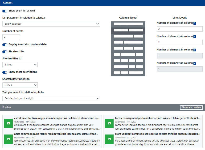
Show Events List As Well - if you activate this slider, additional options related to displaying the events list with the calendar will expand.
List Placement in Relation to the Calendar - from the dropdown list, choose one of the 4 ways to display the list: next to the calendar on the left, next to the calendar on the right, above the calendar, or below the calendar.
Number of Events - max. 30; enter the number of events to be displayed on the list with the calendar.
Display Event Start and End Date - displays information about the event's start date and end date (if the corresponding fields are filled in and marked as active for the event; see: Events module).
Shorten Titles - if you activate this slider, you can decide whether event titles should be shortened. If so, from the "Shorten Titles to" dropdown list, choose how titles should be shortened: to 1, 2, 3, or 4 lines.
Show Shortened Descriptions - similar to Shorten Titles. Descriptions are the first fragment of text that appears in the "Description" field of a published event.
Text Placement in Relation to the Photo - from the dropdown list, choose how text (title, description, and accompanying information) and the main event image will be arranged relative to each other. The choice is dynamically generated in the Preview section.
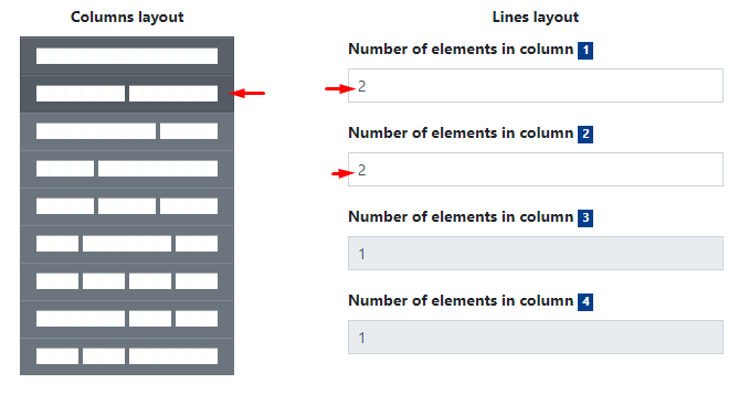
Column Layout and Lines Layout
Column Layout and Lines Layout define how events will appear on the list. You can choose a division, for example, into 2 columns side by side, with each column displaying 2 events.
In the screenshot below, you can see an example of such a layout:
And this is how the widget's column and row settings will look: