 polski
 español

 Monika Borowiec
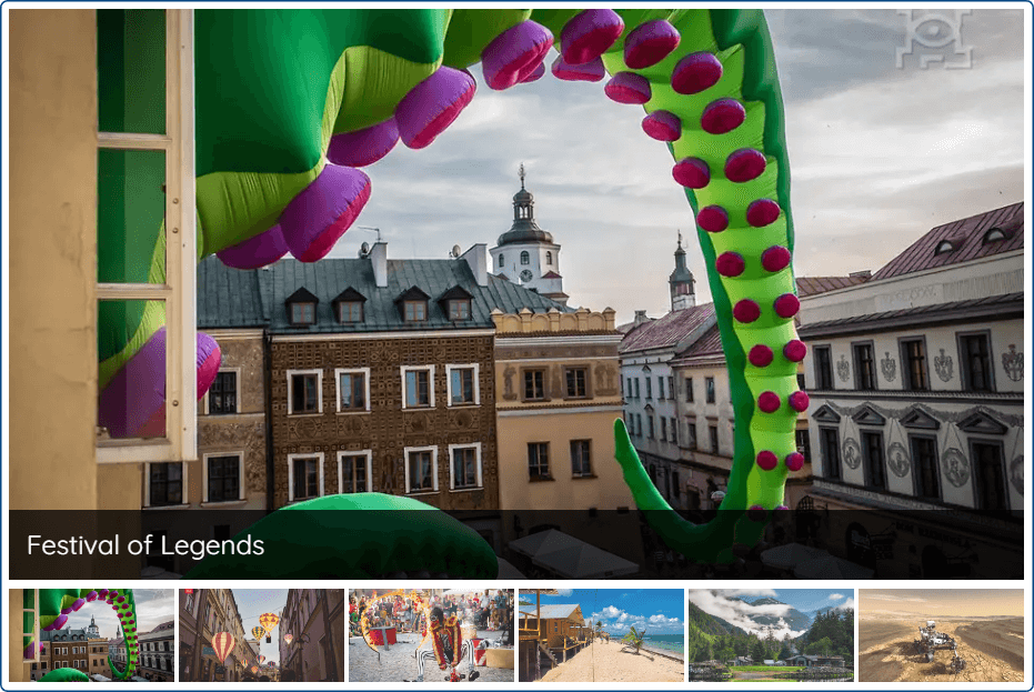
Animated elements, moving images, and videos - all such things grab users' attention and prolong their stay on the website. So, if you want to catch the readers' eyes and increase the likelihood that they will read the latest articles, use our Slider.
The Slider Widget in CMS 4media allows the display of a photo slideshow set as the main photos. Content from modules such as:
- Articles
- Events
- Classifieds
- Business Directory
- Photo Gallery
Depending on the settings in the widget content section, users can scroll through its content by clicking on a selected thumbnail (after clicking, the large photo will reload and display the one the user clicked on). Of course, depending on needs, you can also set it up so that clicking on a thumbnail redirects the user to the article's subpage.
Adding the Widget
The Slider Widget can be added multiple times to any page template. To add the widget, log in to the admin dashboard in CMS 4media. From the main menu, select the Page Builder module. A list of page templates will appear.
Click on the template name or the "Edit" button to view the widgets that have been added to the template, creating its current structure. You can add a new widget where you see the "+Add Item" button. After saving changes, you can drag the widget to a different position, such as another row.
Clicking the "+Add Item" button opens a window with a widget library. Choose the Slider widget to display the widget configuration window.
Feeling lost? Watch our video tutorial: Adding Widgets.
Header Settings
The header section is initially disabled after adding the widget. Activate it by clicking the "Show Header" switch. This will expand the header section, and depending on preferences, customize it to your needs.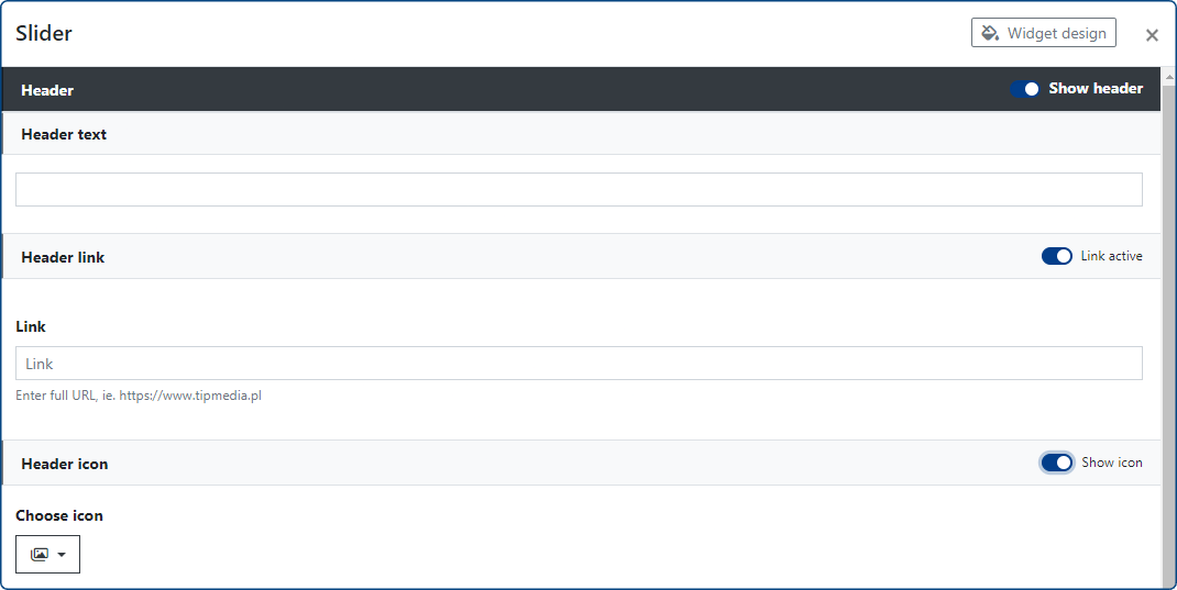
In the header settings, you can decide on:
- Header text - the text displayed on the header bar, the visually highlighted part above the widget's content. You can enter any short text, e.g., "Must Read" etc.
- Header link - here, you can decide whether the header text should act as a link. You can paste a link to a subpage with all the news, etc.
- Header icon - if you activate its display, it will be visible before the header text. It will also act as a link if you activate the Header link. You can change the icon's appearance by clicking "Choose Icon".
Content Settings
In the content settings, you will primarily decide from which module the slider should be created. You will also specify the method of cropping photos, animation speed, and type.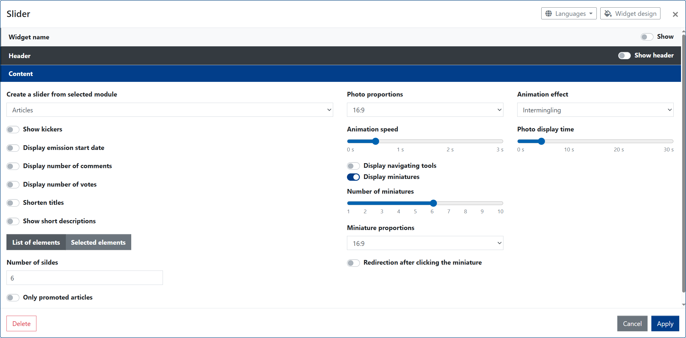
Create a slider from the selected module - from this drop-down list, you can choose the module from which main photos will be retrieved for the slider. Depending on the module, some additional information selection options may differ. For articles, a "Show Comment Count" option is available, but it won't be available if you choose the Events module. In that case, you can decide on other parameters, such as displaying information about the event start and end dates, etc.
Show kickers - go to the edit view of a specific Slider widget (within the [Page Builder] module). In edit mode, enable the Show kickers option and specify the length of the displayed phrase (1 or 2 lines of text).
Shorten titles - activating this switch allows you to decide how many lines the titles of articles, events, classifieds, etc., should be shortened to. Activating this function allows better control of the titles displayed in the slider when the title is too long and breaks, for example, into 2 lines.
Show shortened descriptions - similar to Shorten titles; it allows controlling the length of descriptions displayed with a specific photo in the slider. Descriptions are the first fragment of text that appears on the article or classified page.
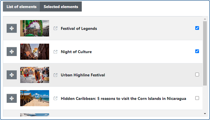
You can also choose whether the widget should display the entire content of the module or only selected content. You will decide on this with the buttons:
- List of elements - by choosing this option, you can decide in the "Number of Slides" field about the number of displayed recent content published in the module (max. 20).
- Selected elements - this option allows for greater control; you can choose which content, e.g., articles, should be displayed in the slider and set their order (by drag and drop).
In the further part of the Content Settings section, you will find options dedicated to photo proportions, animation, and behavior after clicking:
Photo proportions - from the drop-down list, you can choose the cropping method according to proportions: 1:1, 4:3, or 16:9.
Animation effect - from the list, you can choose the animation method (transition between one photo and another): intermingling or swiping.
Animation speed - with this switch, you can set the duration of the animation - from 0 to 3 seconds.
Photo display time - with this option, you can decide how long the photo will be displayed in the slider (in the range from 0 to 30 seconds).
Display navigating tools - if you activate this slider, arrows to the left and right will be visible in the slider, allowing the user to scroll through the photos.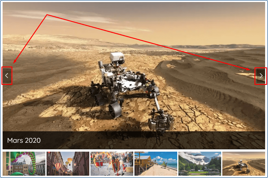
Show thumbnails - if you activate this switch, additional settings related to displaying thumbnails will appear, i.e., small photos below the large, main photo in the slider.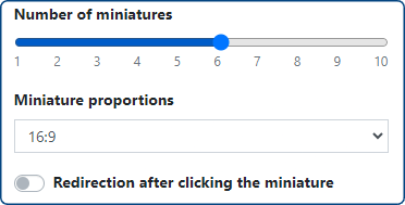
Here, you can decide on the number of displayed thumbnails (max. 10), proportions (ratio) (1:1, 4:3, 16:9), and behavior after clicking on a thumbnail (whether redirection should occur after clicking).
If you need additional or advanced settings regarding the widget's appearance, click the "Widget Design" button at the top of the configuration window. A section will expand where you can decide on additional visual aspects of the widget, such as margins, shadows, background, and font colors.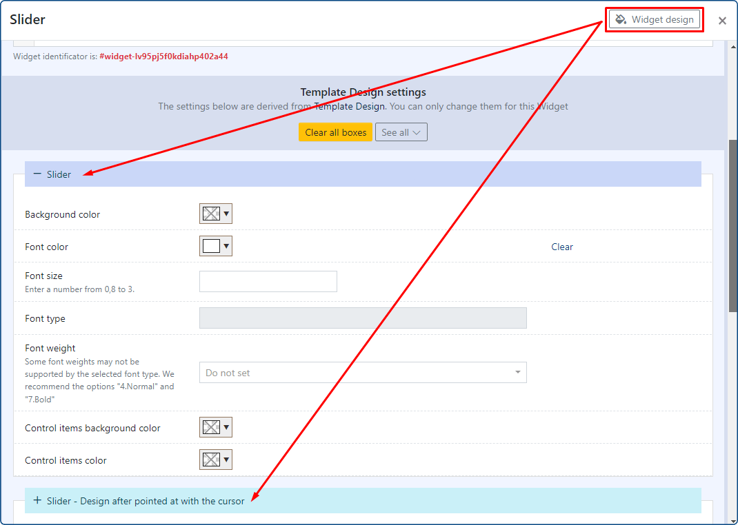
New! Displaying Live Coverage in the Slider Widget
To enable this functionality, go to the edit view of a specific Slider widget (within the Page Visualization module).
In edit mode, click Create slider from the selected module and choose Live Coverage from the list.
All other functions remain unchanged, i.e., you can choose between displaying the latest entries designated for the Slider or manually selecting specific entries.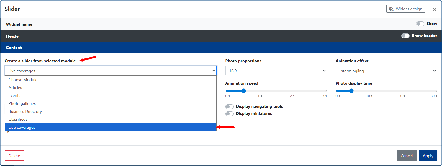
Important! At the moment, the system does not allow mixing content within a widget, i.e., it is not possible to enable rotation of articles and live coverages in the same slider.
Adding live coverages to the slider
Open the live coverage in edit mode (or create a new one). In the form, you’ll find options that let you assign the coverage to the slider. To display the story in the widget, you must set a start date for when it should go live.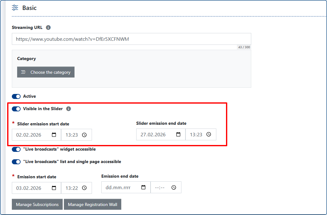
Important: The slider can display live coverages that are scheduled to start, currently live, or already finished.


